





Tatyana Nezhelskaya

Multidisciplinary Designer  +  Art-director

Spheres Of Working:

  1. 1.Branding
  2. 2.Editorial Design
  3. 3.Packaging
  4. 4.AI Visuals
  5. 5.Brand Platform

Hello, my name is Tatyana Nezhelskaya.
I am a Graphic Designer and Art Director. I graduated with a Bachelor’s
degree in Communication Design from HSE ART & DESIGN SCHOOL.
I specialize in developing visual identities, complex structured
printing and branding.

Key Clients:

  1. 1.Yandex
  2. 2.Sber Private Banking
  3. 3.A-Club
  4. 4.MR Group
  5. 5.Cosmoscow

In many of these projects, I worked directly within the existing
brand identity, developing it for the required unique media.
However, quite often I also had to come up with a new brand identity
for a specific event or occasion, and sometimes it had absolutely no connection
to the existing brand identity.

As part of my work with these brands, I developed absolutely all the layouts
for production (for example: complex creative photozones, from idea to layouts,
applying branding to various materials and items,
simple and complex printing).

Timeline

from to
  1. 20042014Art School
  2. 20182021HSE ART & DESIGN SCHOOL
  3. 20212024Freelance
  4. 20242026IN–OUT STUDIO (Senior Graphic Designer)EnForma Bureau (Graphic Designer & Art-Director)

Contacts:

Selected Works
Portfolio

Le Matin lettering in a cloud of ink Clock face in a cloud of ink
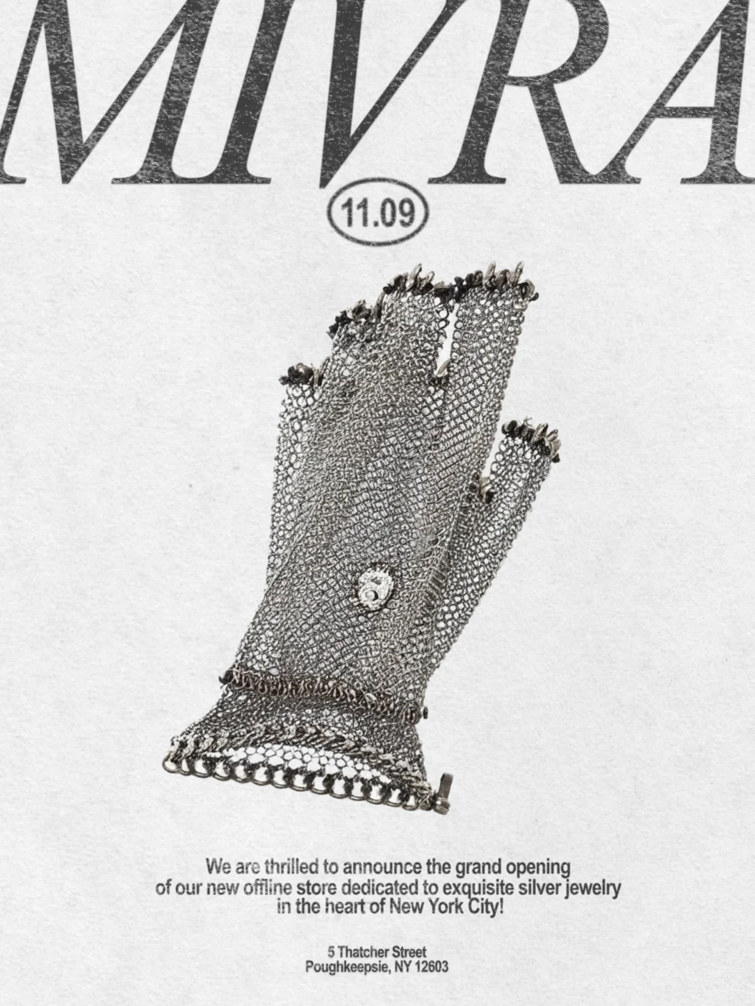
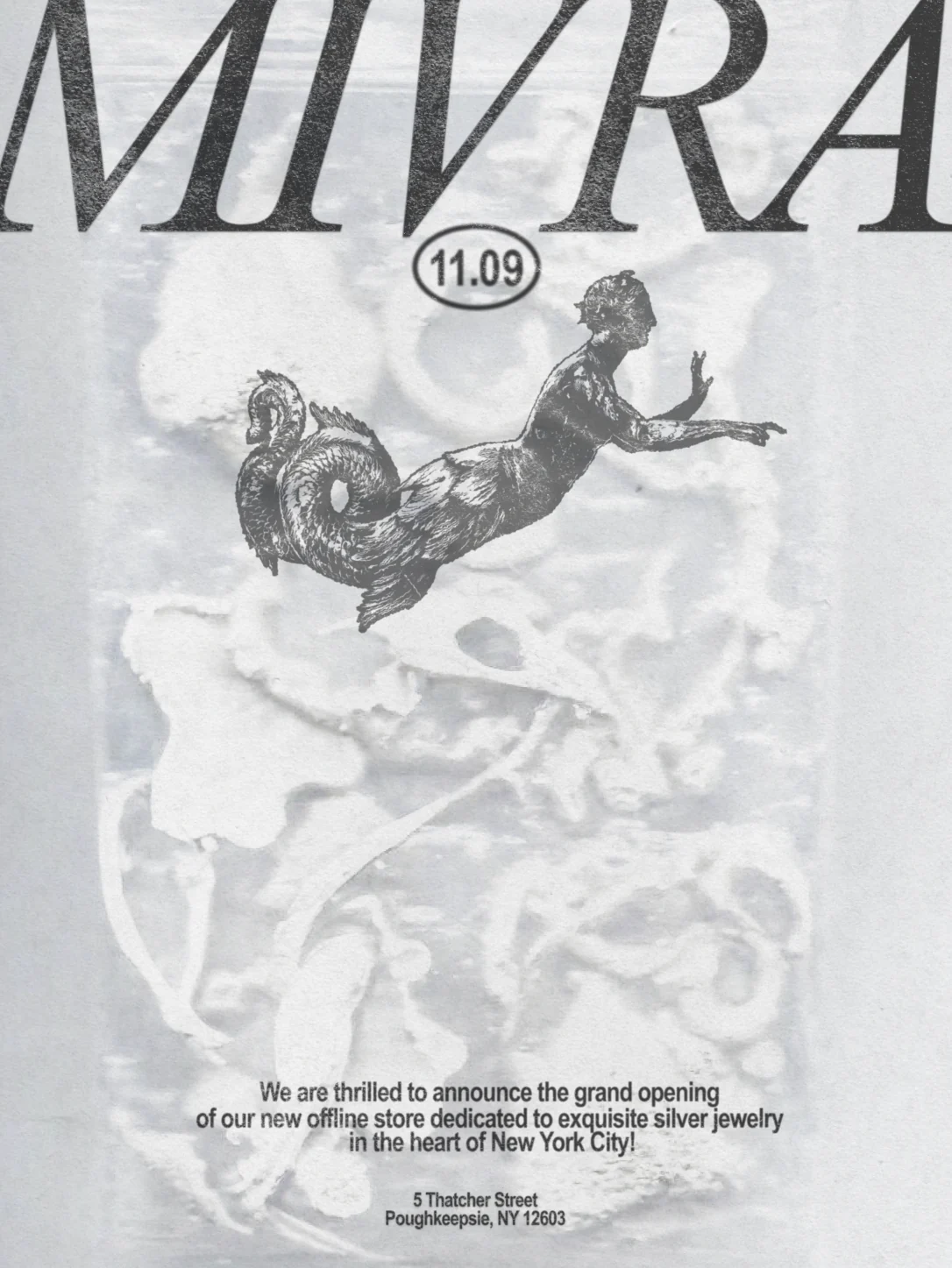
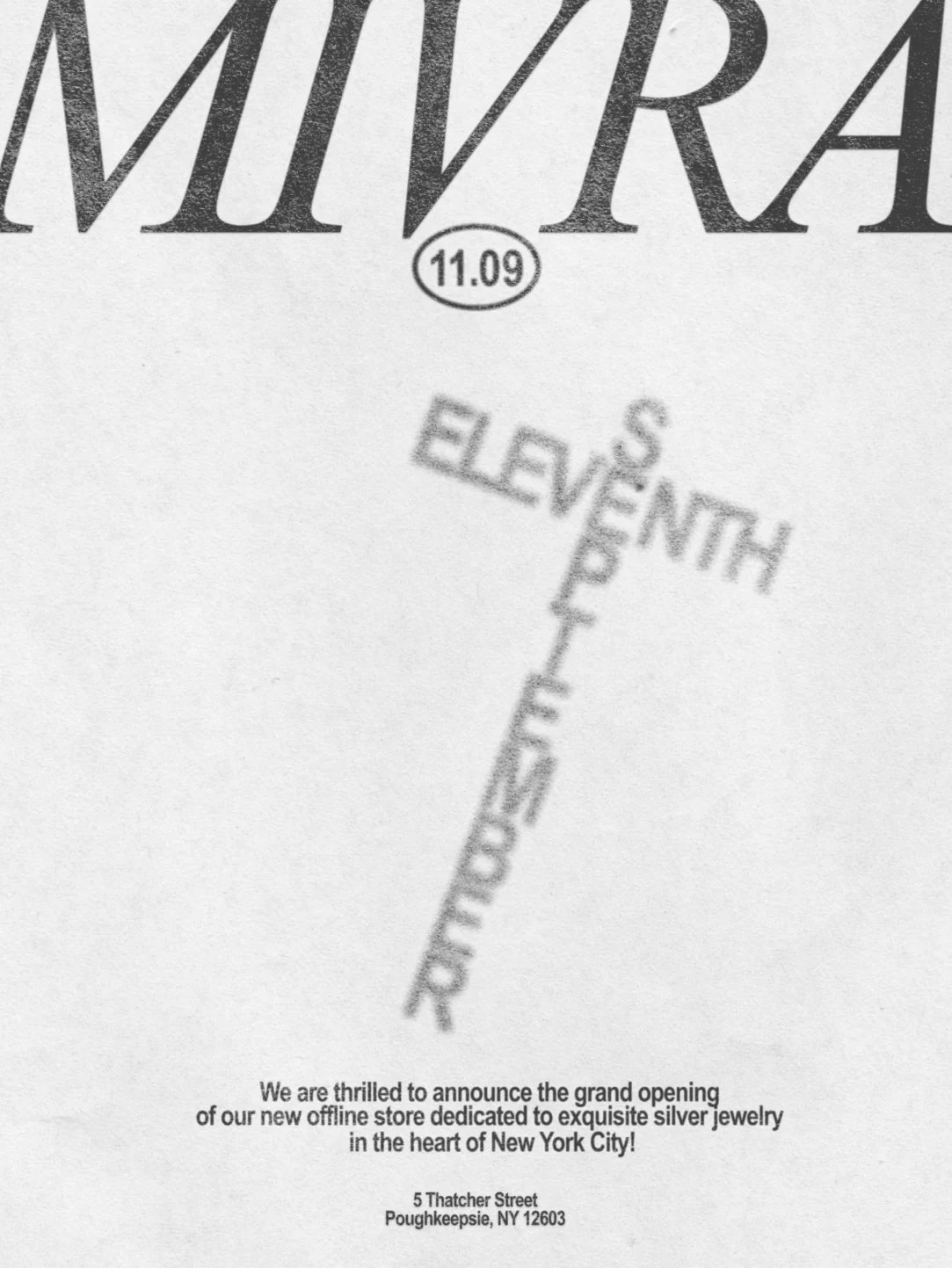
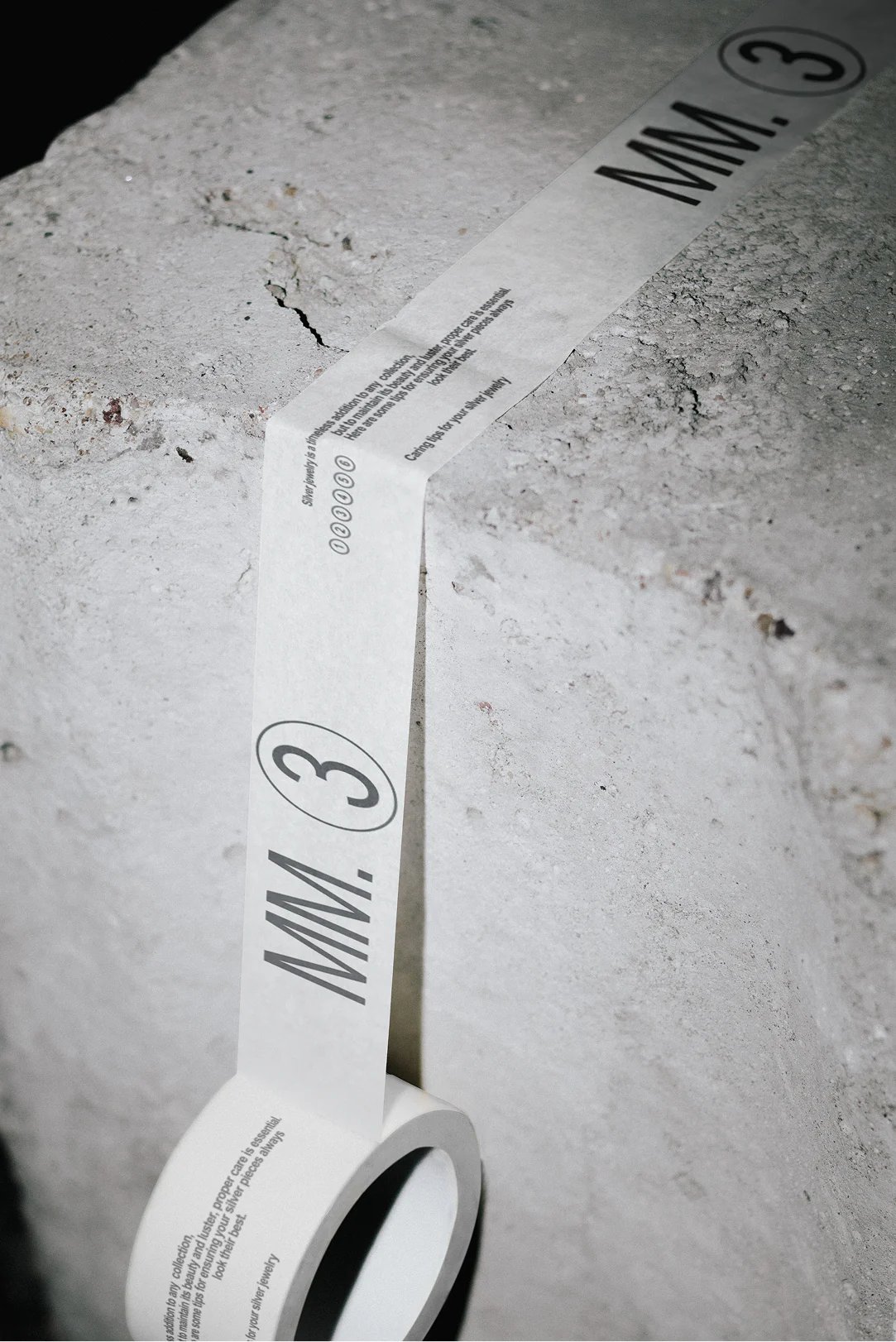
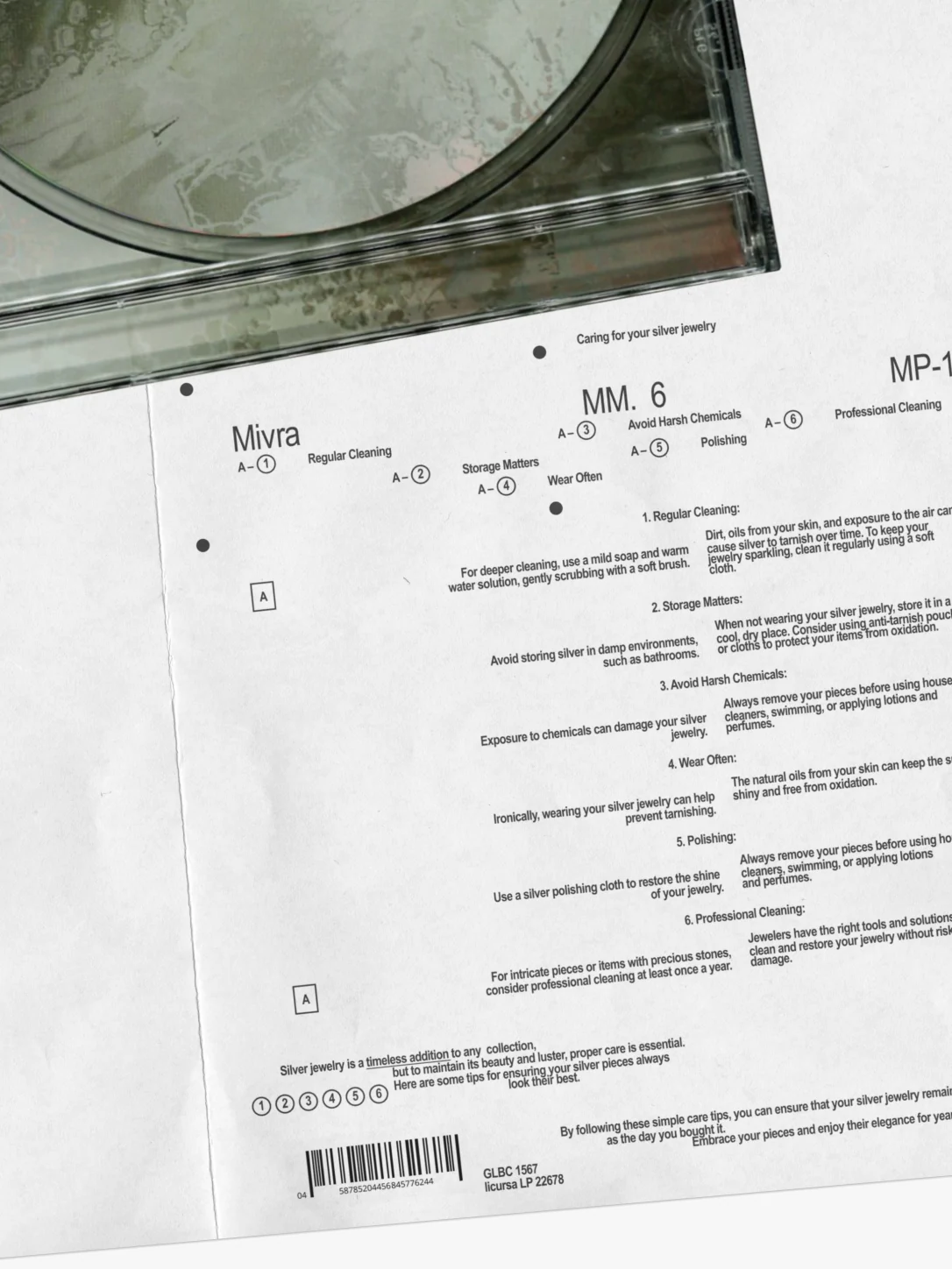
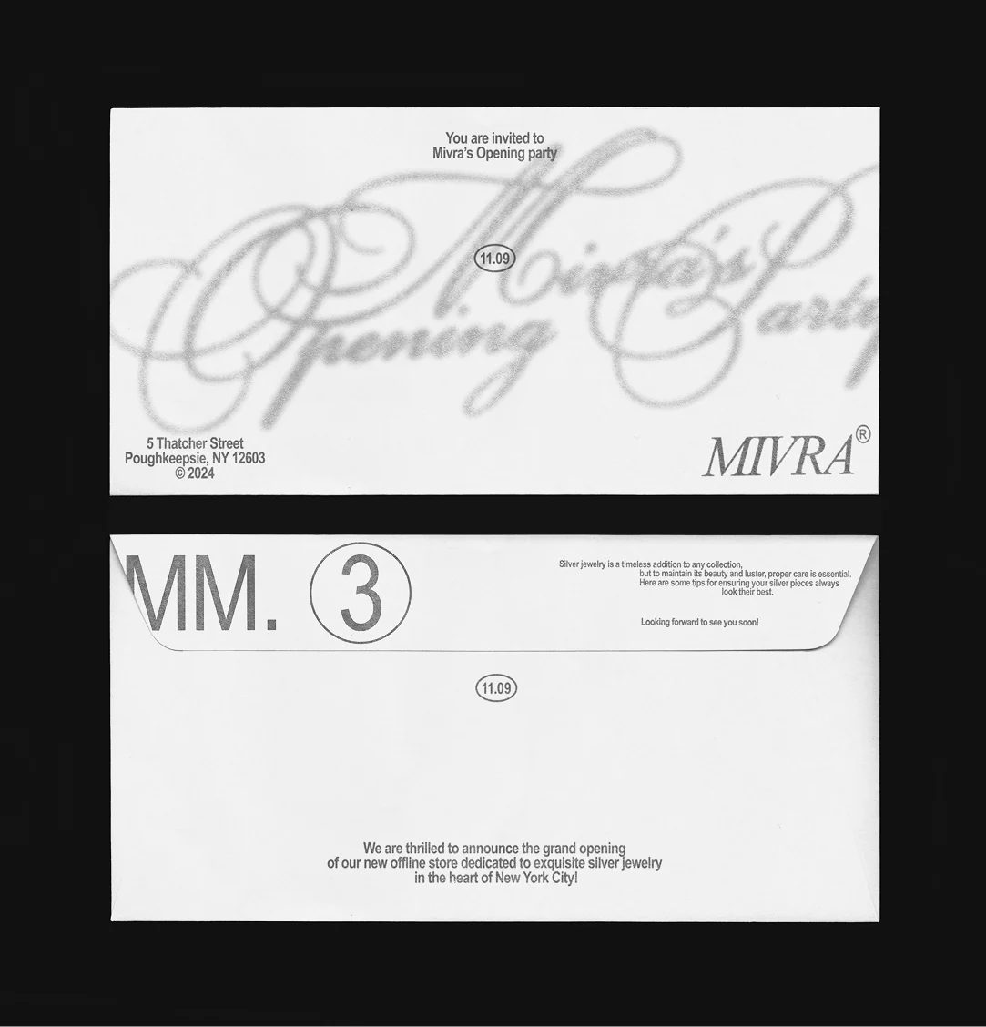
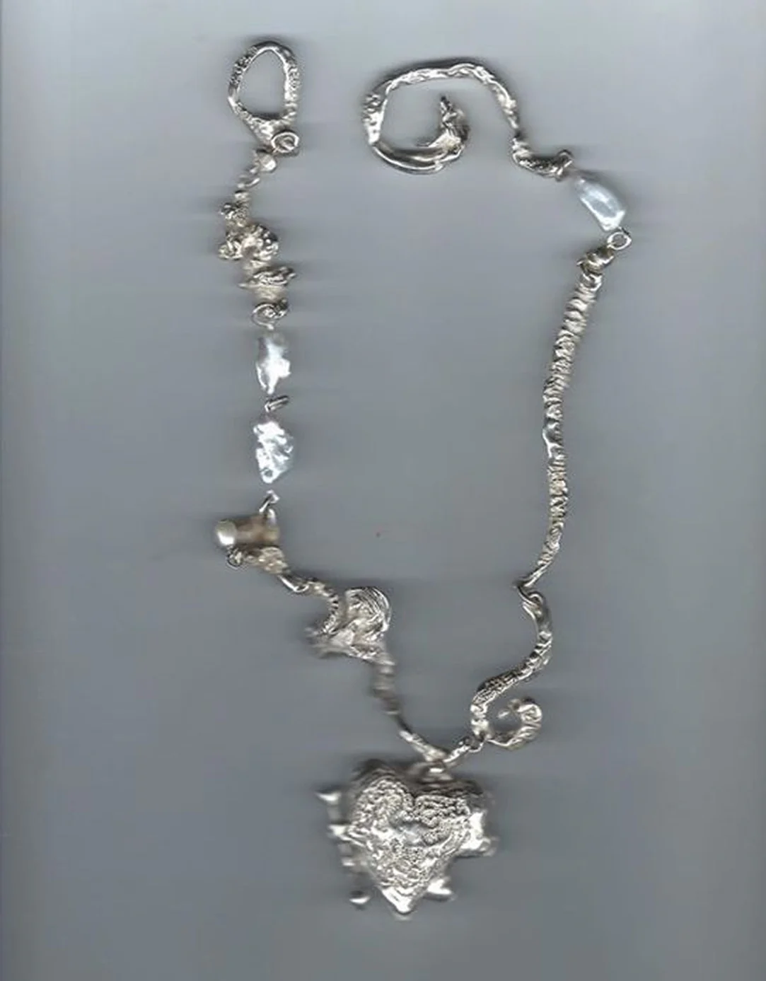
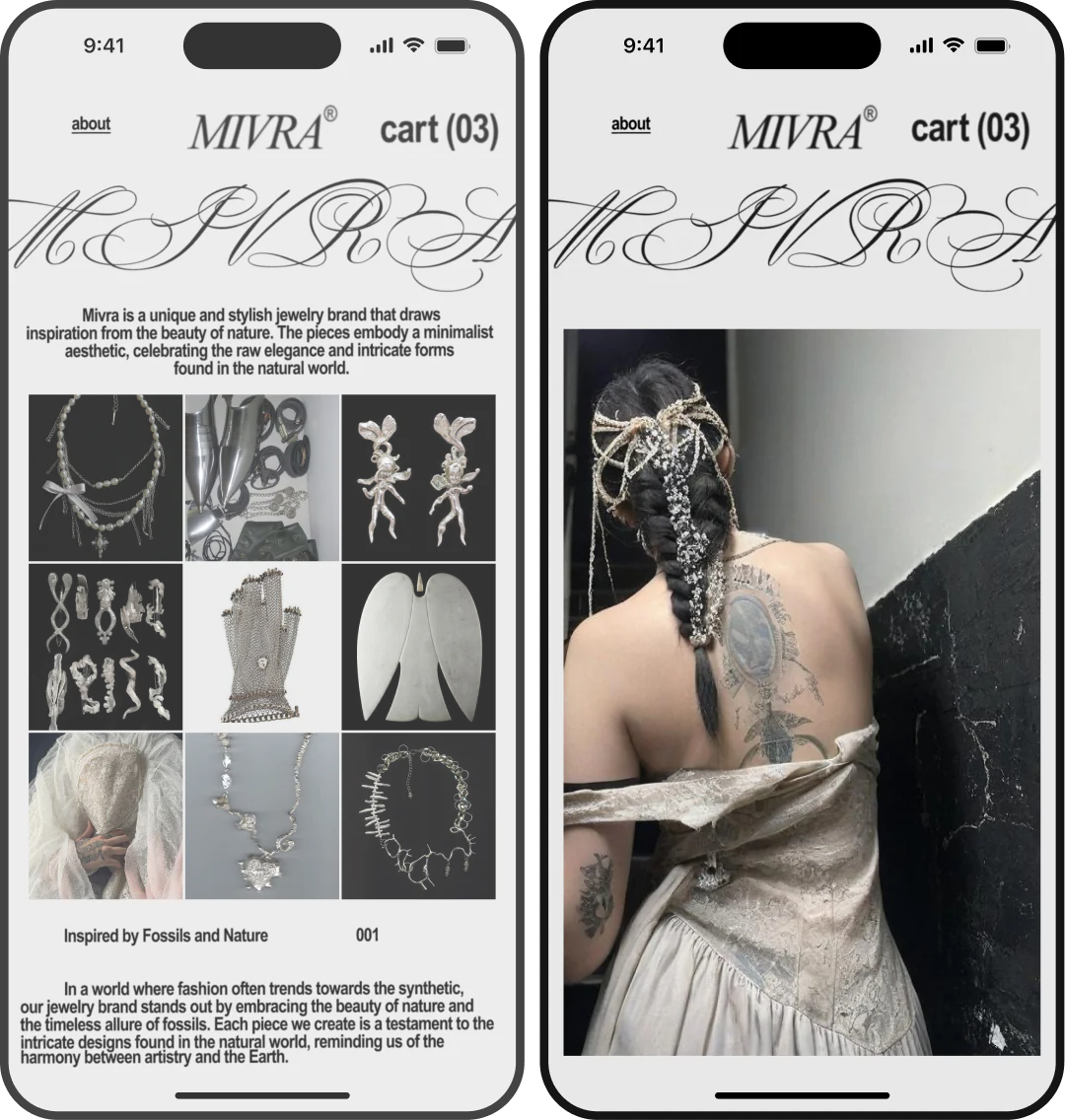
Mivra embossed bag and label Mivra jewelry packaging box Mivra packaging system Mivra branded bag Mivra opening invitation with chainmail glove Mivra opening invitation with mermaid illustration Mivra opening invitation with typographic artwork Mivra printed packaging tape Mivra silver jewelry care sheet Mivra opening invitation and envelope Mivra silver necklace Mivra mobile website screens Mivra fossil sample rings collection Mivra sculptural jewelry objects collection

Mivra
Jewelry

  1. 1Brand Identity
  2. 2AI-Visuals
  3. 3Website

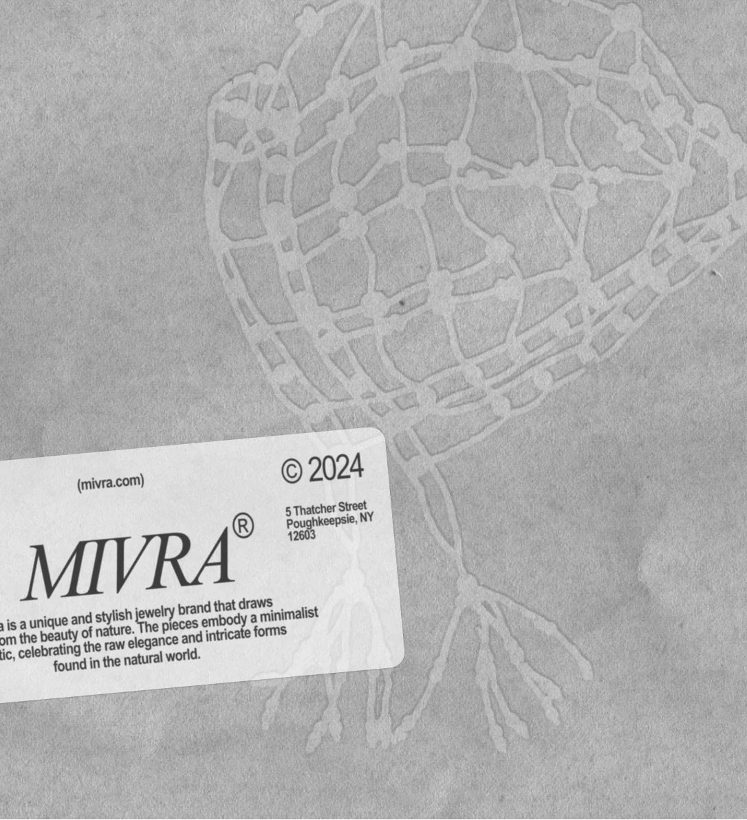
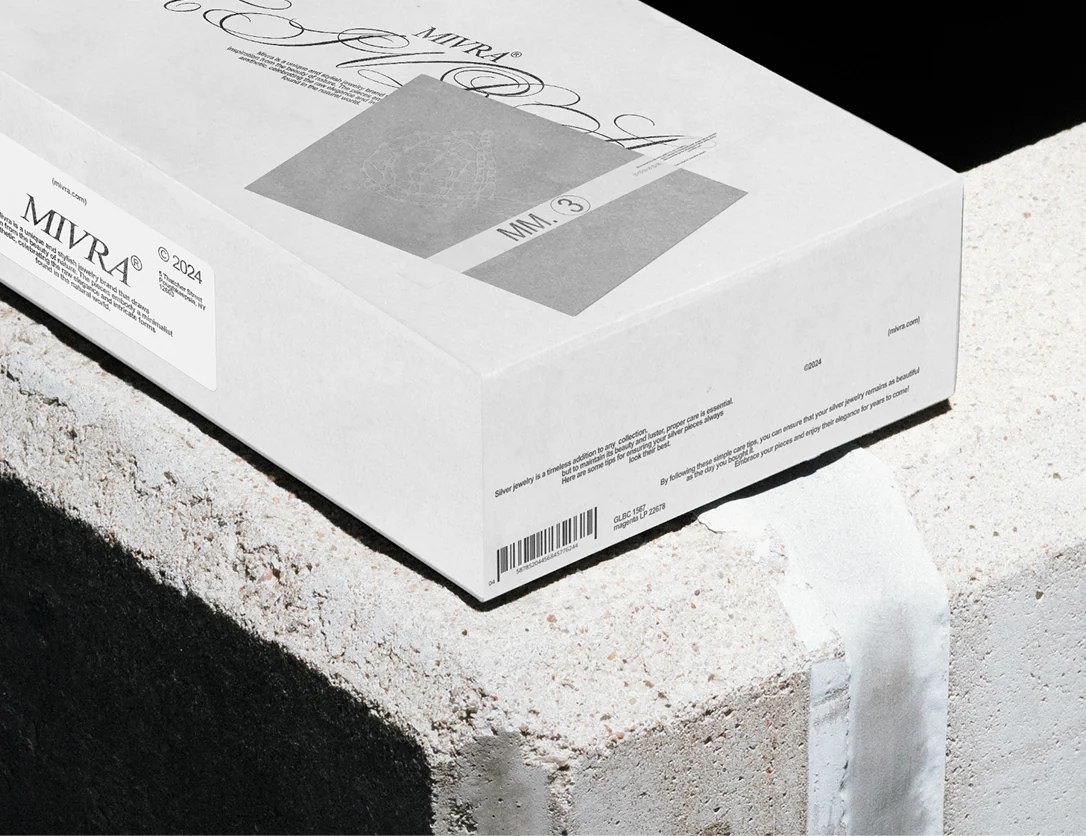
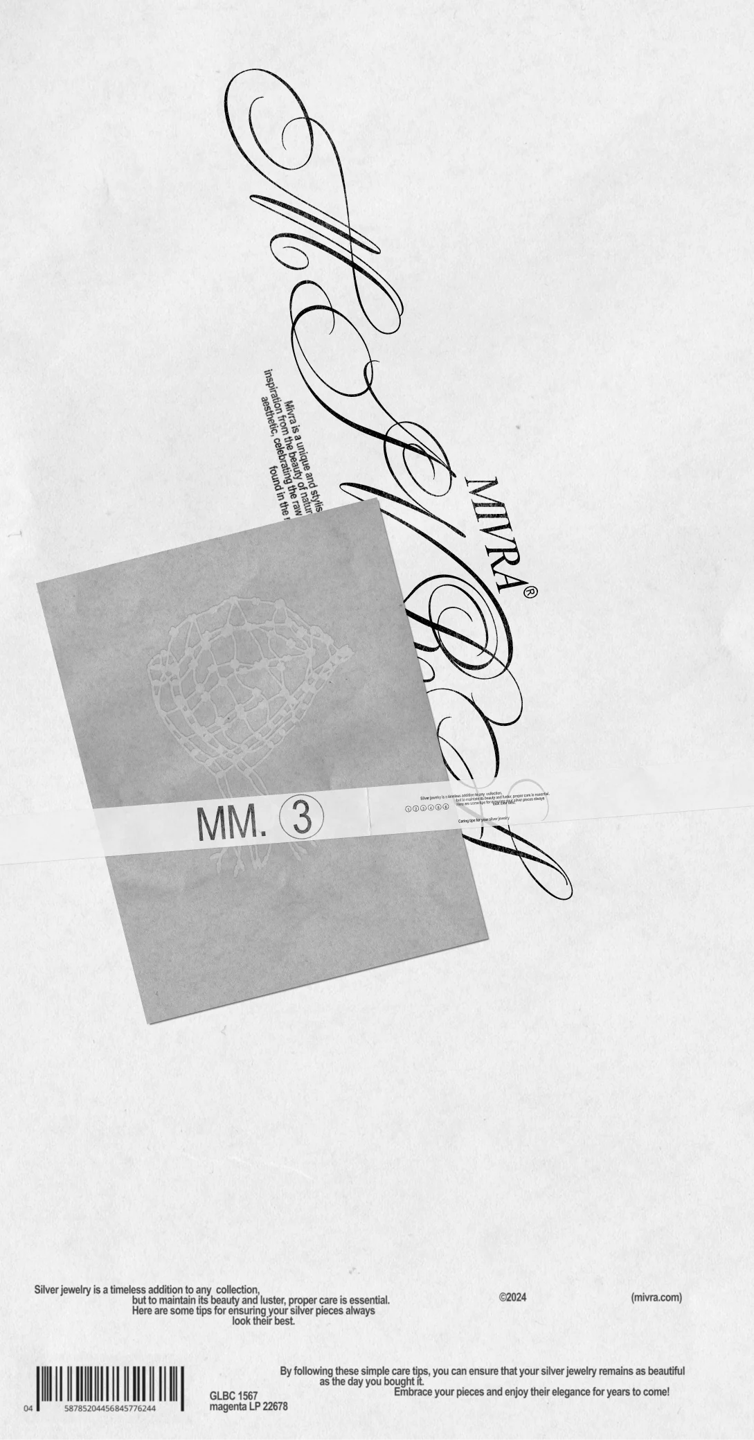
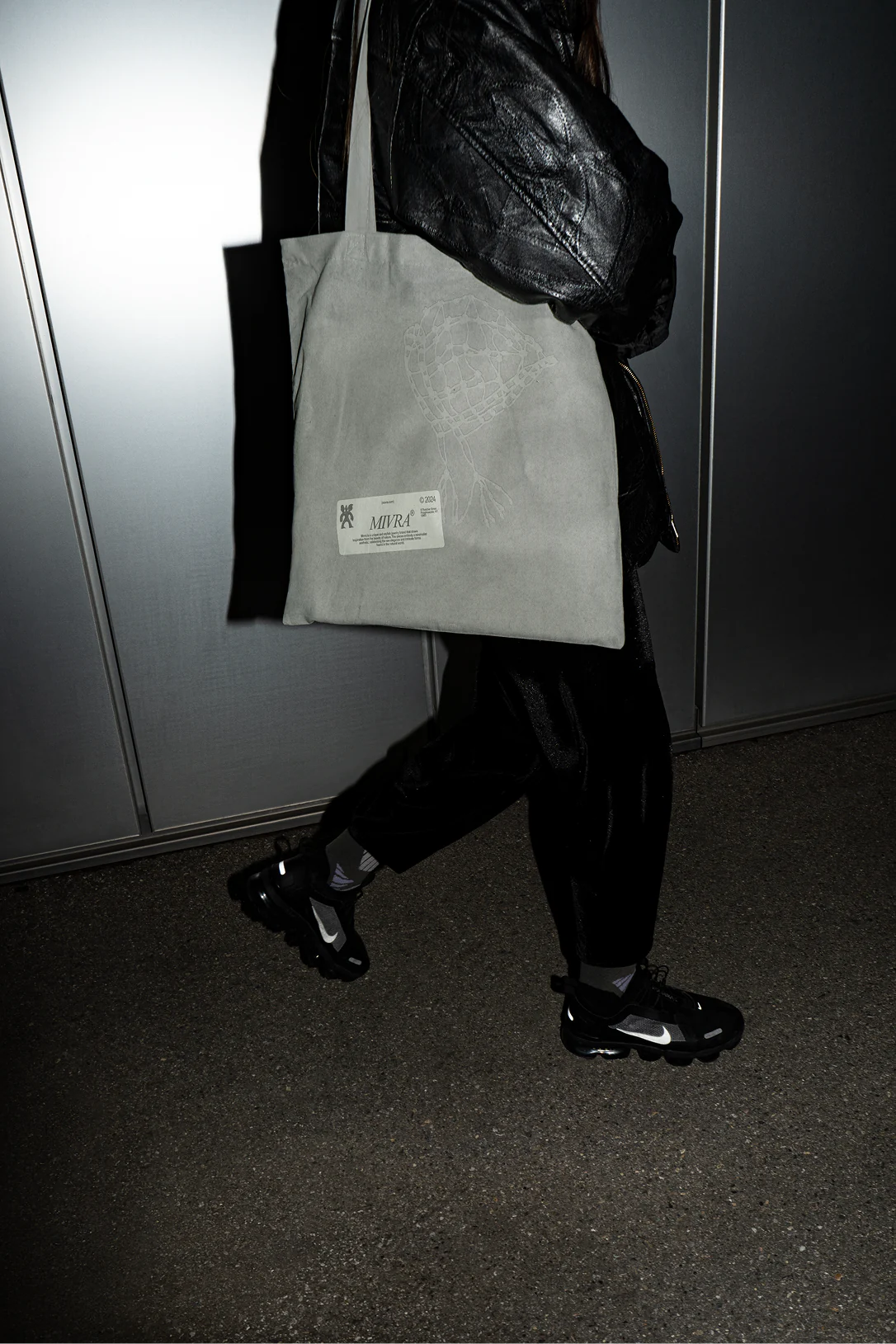
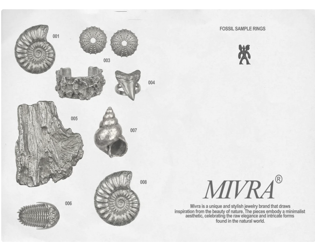
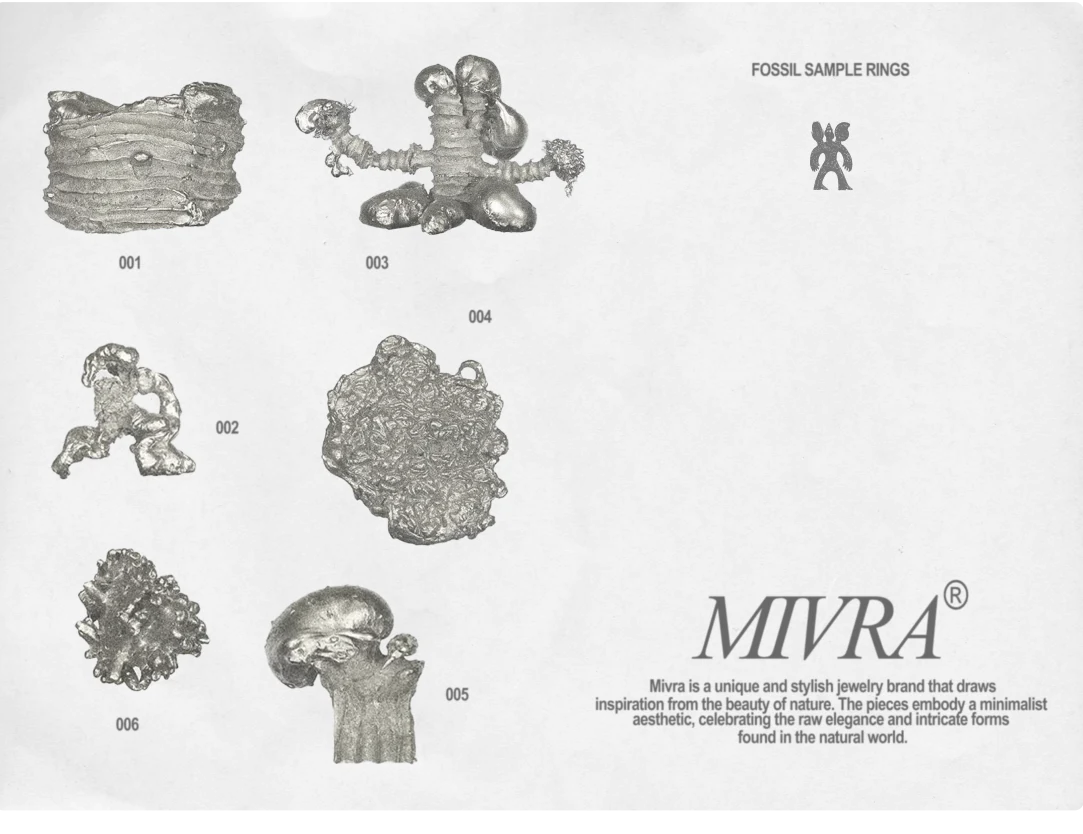
Mivra is a unique and stylish jewelry brand that draws inspiration from the beauty of nature. The pieces embody a minimalist aesthetic, celebrating the raw elegance and intricate forms found in the natural world.

The brand’s concept appears quite eclectic. The creators aimed to combine modern style with the aesthetics of antiquity. In different collections, they want to reflect various historical periods, from images of the Cambrian period to Medieval motifs.

The main metaphor used to create this visual identity is the comparison of the brand’s jewelry to fossils. (Fossilis refers to fossils—remains of organisms or traces of their life activities that belong to earlier geological eras.)

(Fossilization is the set of processes that transform deceased organisms into fossils. It involves the influence of various environmental factors and the processes of diagenesis—physical and chemical transformations that occur as sediment turns into the rock in which it is embedded.)

“Our jewelry is like ancient fossils, just as strange, carrying the spirit of a bygone era.” The pieces from this brand literally look as if they are made from various types of fossils mixed with artifacts found during excavations.

To reflect the chosen metaphor in the branding, I decided to incorporate three-dimensional embossing of their jewelry into the print materials. A modern typography was selected to complement these archaic images. This symbiosis reflects the brand’s desire to be contemporary while leaning towards its historical roots.
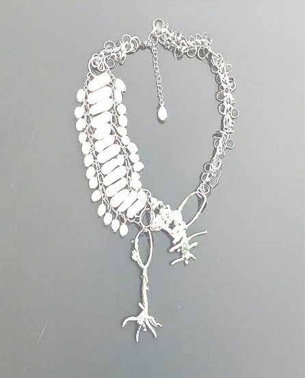
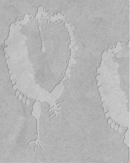
Original Mivra necklace Embossed Mivra necklace artwork
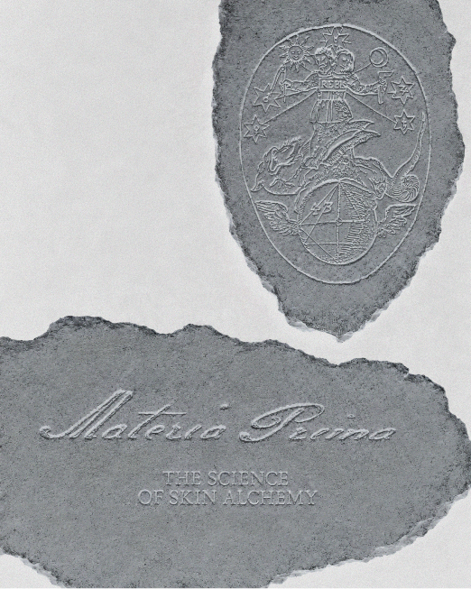
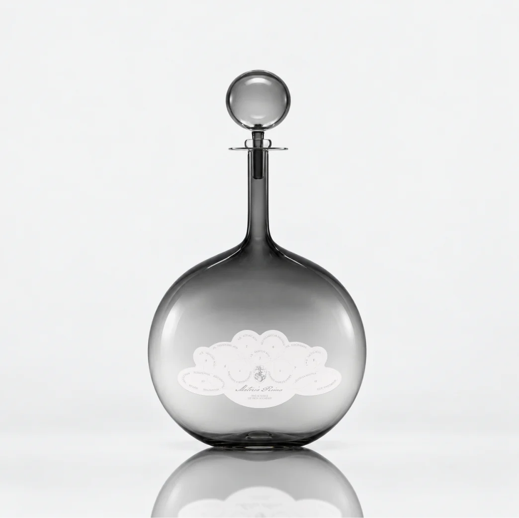
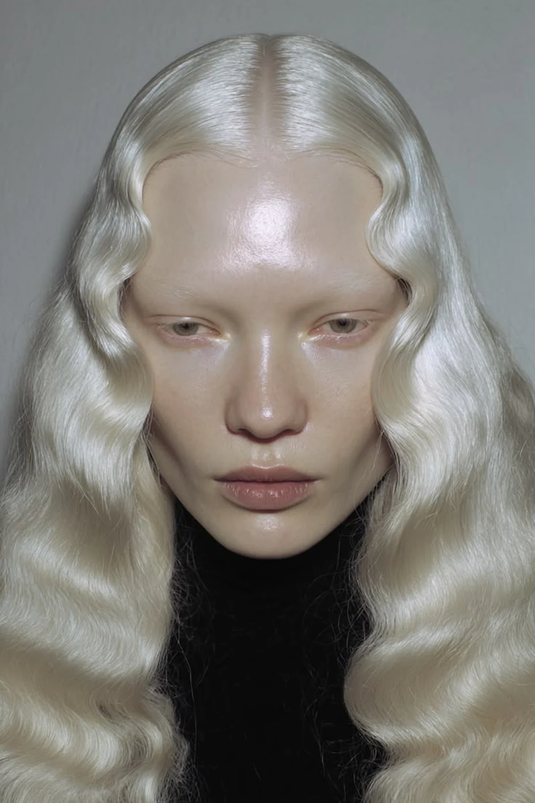
Materia Prima embossed brand artwork Materia Prima glass skincare bottle Materia Prima portrait with platinum hair

Materia
Prima

  1. 1Brand Identity
  2. 2Brand Platform
  3. 3Packaging
  4. 4AI-Visuals

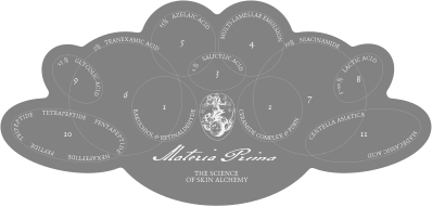
Materia Prima is a skincare brand inspired by alchemy and the idea of transformation. Its philosophy is rooted in materia prima — the primordial matter from which something new can be created. In the brand, skin becomes this living matter, while skincare is understood as a continuous, lifelong process of refinement, restoration and transformation.

Materia Prima alchemical skincare diagram

Design in progress

Strochka receipts over an inverted portrait Strochka New Collection admission tickets Strochka portrait with garment label Strochka Atelier Magazine cover spread Strochka atelier tag in a binder Strochka New Collection programme and tags Strochka patterns and references booklet spread Strochka atelier website and bag catalogue

Strochka
Non-typical
Atelier

  1. 1Brand Identity
  2. 2AI-Visuals
  3. 3Website

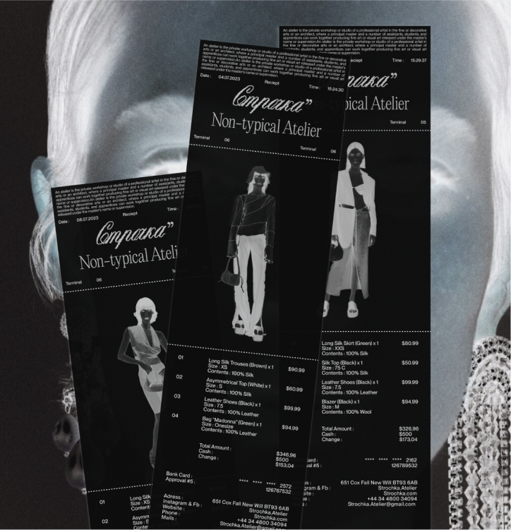
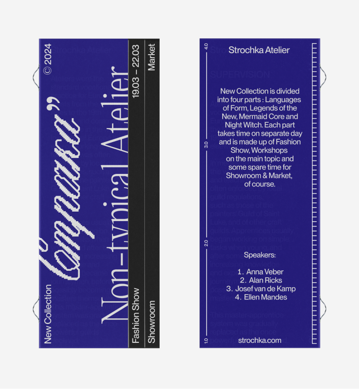
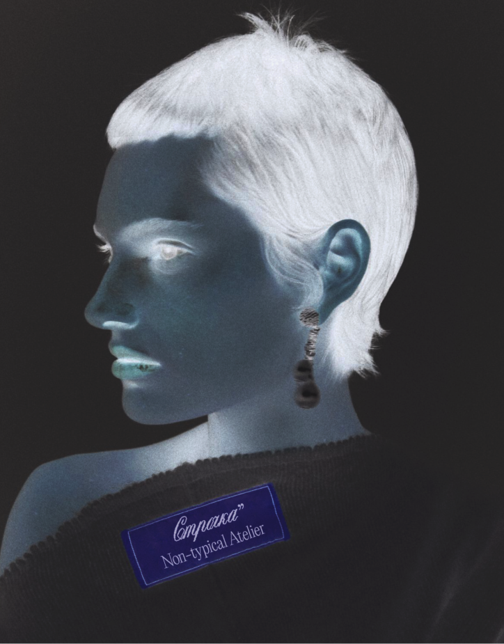
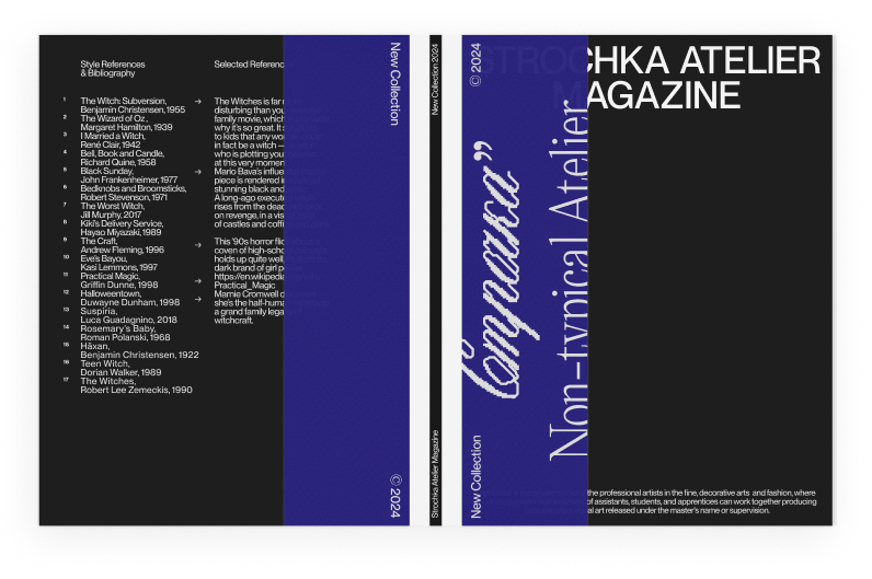
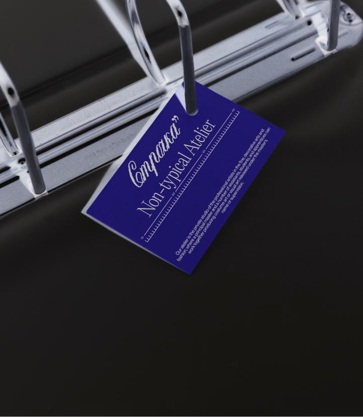
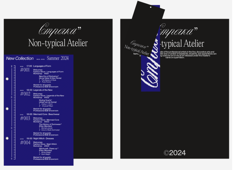
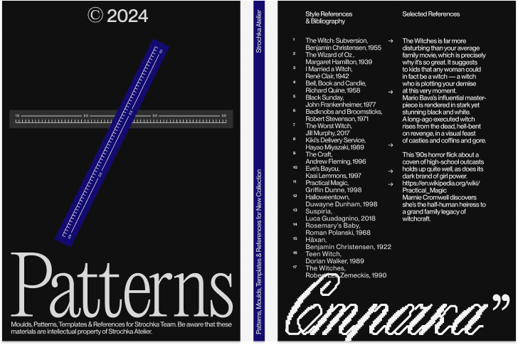
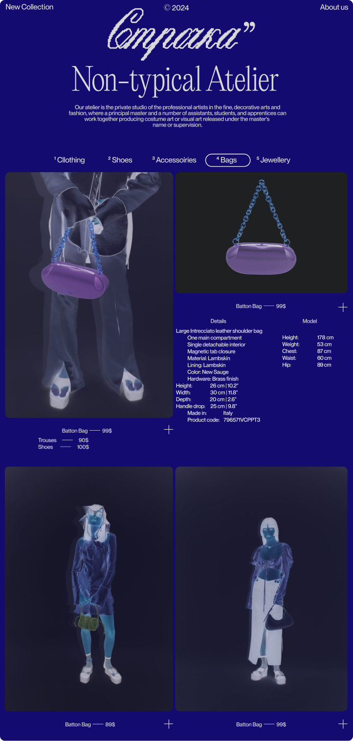
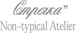
Strochka Non-typical Atelier is a unique premium clothing brand that offers the possibility of tailoring designer items to your measurements. In the concept stores of Strochka, you can try on your favorite models and have them adjusted to fit your figure in the fitting room. After payment, seamstresses and designers create individual outfits for you, perfectly suited to your parameters.
The founder of the brand is a young woman from Russia;
however, the stores are primarily located in America.
The main requests from the client were to play on the
Russian name, leaving it in Cyrillic, convey the uniqueness
of the project and its products to the consumer,
and emphasize the premium segment.

The logo consists of two parts. The first part
is essentially an accent font that refers to the progressive
style and avant-garde collections of the brand. Meanwhile,
the second part is set in a modern-style serif font, which,
on one hand, reminds us of world-famous fashion houses
with a long history, and on the other, declares a new
approach and a rethinking of their traditions.
When developing the logo, it was important to effectively
express and highlight the uniqueness of the brand while also
provoking effective associations for the potential audience
at first glance. In this context, the main part of the logo
is designed in the style of machine stitching, resonating
with it both in the name and in the visual representation.
The additional part clearly and distinctly positions the brand.
Both of these elements also appeal to the foreign audience,
which is an important segment for the brand.

Morana lounge and cocktail bar menu Staff T-shirt with the Fedalio Korach Club bird Hand soap and hair mask bottles Book cover with a cocktail glass on top Immersive Performance poster and invitation Fedalio Korach business cards without a background

Fedalio
Korach

  1. 1Brand Identity

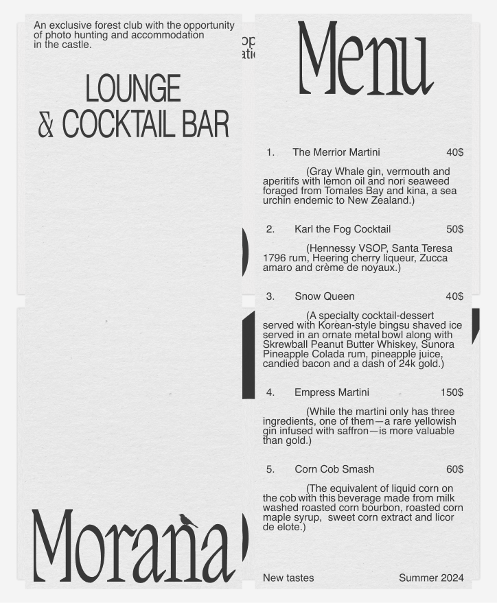
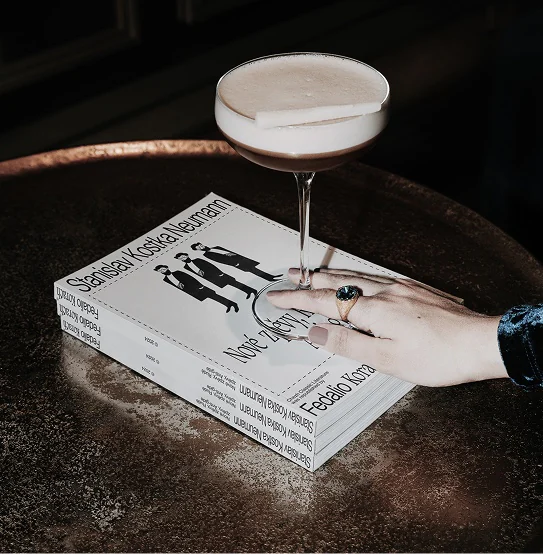
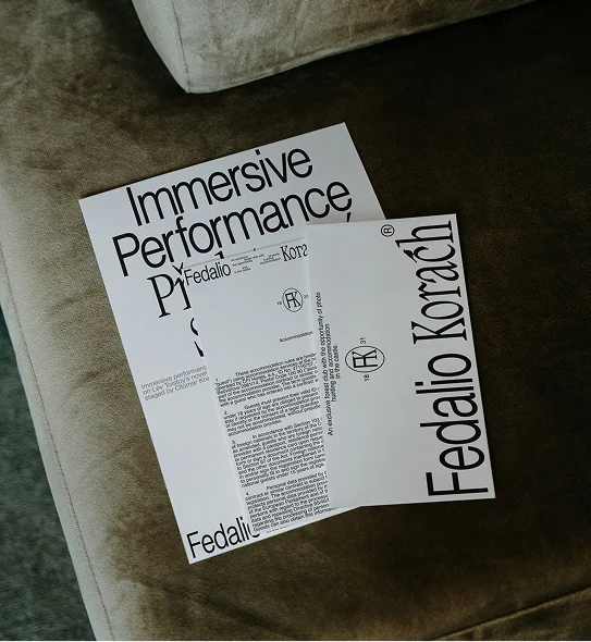
Fedalio Korach is a country club located
in an ancient castle in the Czech Republic. The highlight
of this place is the photo hunt. Staying in the castle, which
preserves the atmosphere of a bygone era, is accompanied
by opportunities for horseback riding, balls, photo hunts,
wine tastings from a local winery, and immersive theatrical
performances. Everything is designed so that each guest can
feel as if they are in the mid-19th century while still enjoying
modern comforts. One of the main ideas of the project is the
combination of an authentic atmosphere of a past era with
contemporary comfort and a conscious approach
to a luxurious lifestyle.

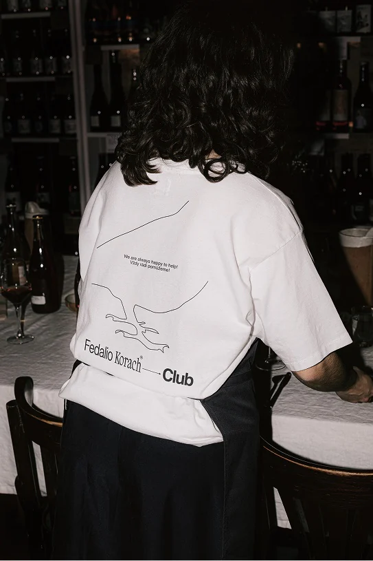
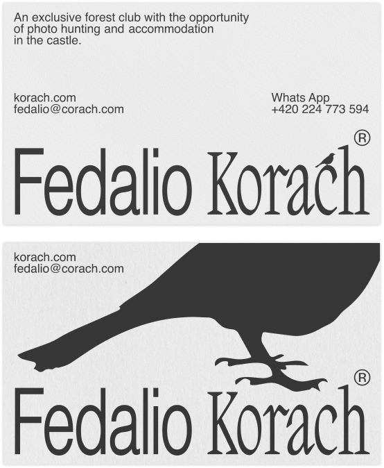
The logo consists of a typographic part and
an icon in the form of a bird. The bird appears in the logo
as a reference to the photo hunt, the main feature of this
country club. This bird exists in the logo in dynamic poses.
Depending on the layout and its role, the bird either sits
on the typographic part or scales up and is placed promi­-
nently, extending beyond the boundaries of the medium.
This technique is a nod to the zooming of a frame
on a camera, which is highly relevant during
the photo hunt.

The typographic part of the logo consists of two types
of fonts – a grotesque and a serif. The grotesque symbolizes
a modern and comfortable approach to leisure activities, while
the serif represents the authenticity and luxury of the castle,
the old-fashioned entertainment, and the atmosphere
created by the Fedalio Korach team.

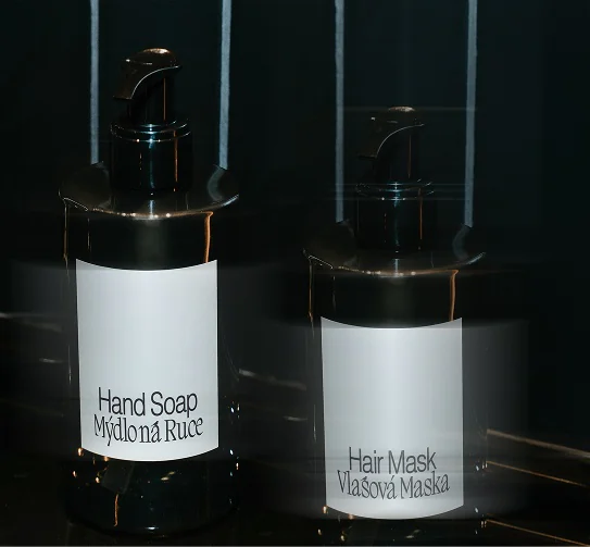
The identity of Fedalio Korach is mainly
based on the combination of serif and grotesque fonts
in the headers, a specific photography style, text layout,
and the dynamic part of the logo. Specifically, this refers
to the bird, which, beyond the logo, can be used on other
mediums in the same roles, as if "flying" from place to place.
Additionally, depending on the medium, it scales up, filling
the entire space of the layout, or sits delicately on the typo­-
graphic part, as if perched on a tree branch. At the same
time, the viewer observes the bird and its movements from
medium to medium, which is also a reference to the photo
hunt, the main feature of this country club.

Parcel wrapped with an Inhabitants of Sunday label Woman reading the Inhabitants of Sunday catalogue Catalogue covers and spine Business cards in hands Silk pillowcase postcards Paper shopping bag The Fragrance of Cleanliness perfume bottle Catalogue held against a striped shirt Round coasters in three colours

Inhabitants
of Sunday

  1. 1Brand Identity

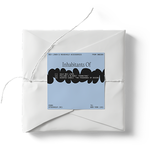
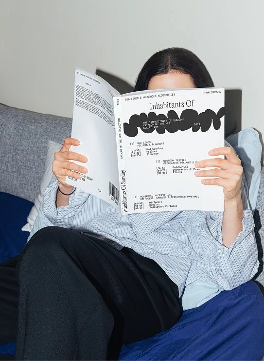
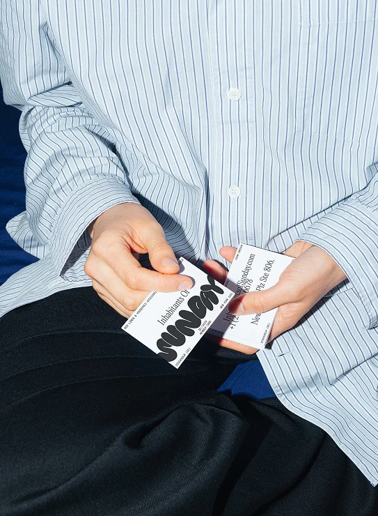
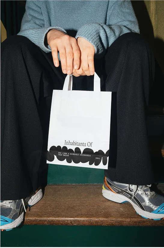
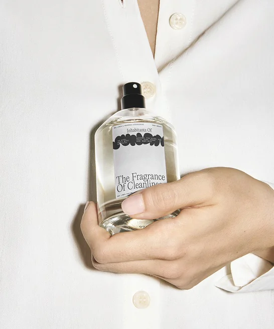
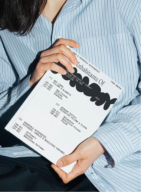
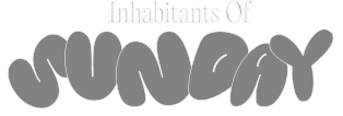
The Inhabitants of Sunday is bed linen
and home accessories brand. It specializes in creating
maximum comfort in the home, through associations of its
target audience with childhood. "Childhood is perceived
by our brain as the most pleasant time of life, filled with warm
cozy family evenings." In addition to a large collection of bed
linen, the brand also offers a range of home fragrances,
various sachets, candles, and vinyl records with
atmospheric music.

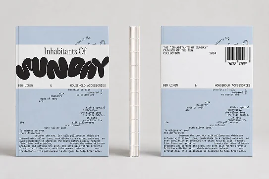
The main metaphor for the identity is the
connection to childhood. The logo consists of two parts.
The first part is set in an antique font, which reminds
us of the fairy tales that were read to us in childhood.
(Many old children's books are printed in antique type.)
Meanwhile, the second part of the logo features plump
letters, resembling pillows lying on a bed, leaning
in different directions. They are just as soft
and pleasant.

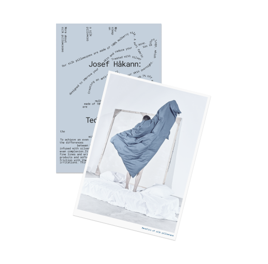
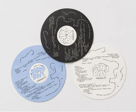
The layout on the materials also references
sleep, particularly the moment of falling asleep when the
brain starts to function less effectively, and all the words
we hear, as well as our thoughts, behave strangely,
chaotically mixing in our minds. Thus, the text layout
on the materials is chaotic and peculiar.

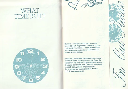
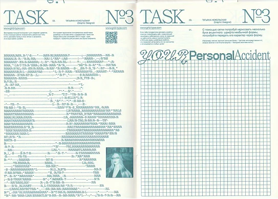
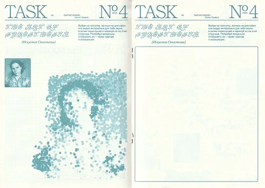
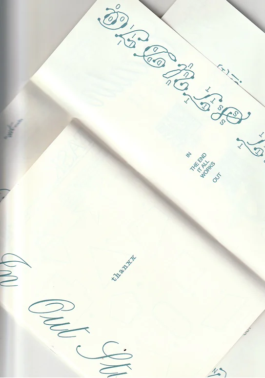
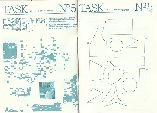
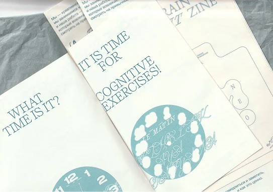
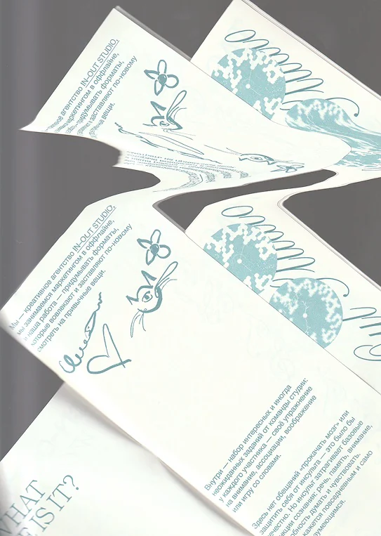
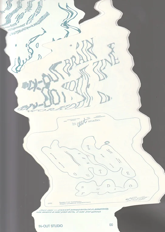
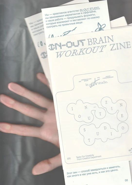
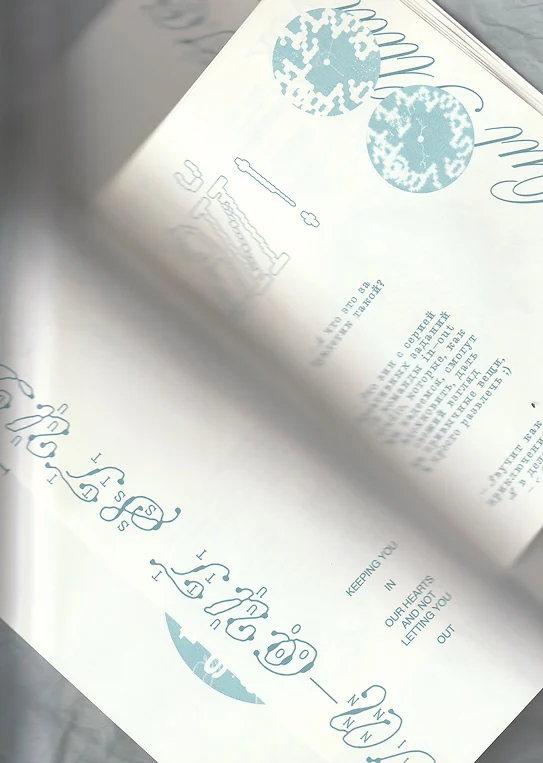
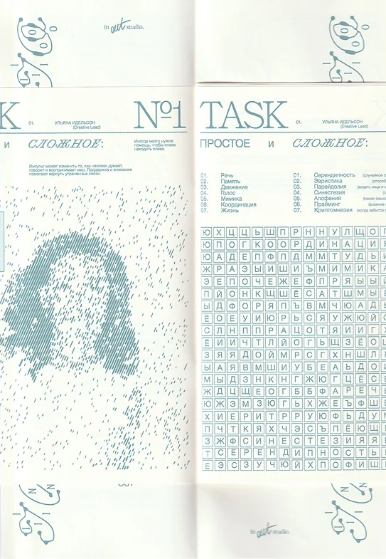
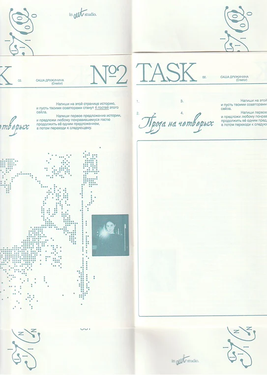
Stack of IN–OUT Brain Workout Zine copies Zine cover on grey tissue paper Zine pages with the Hey! greeting What time is it? spread Keeping you in our hearts spread Task No. 1 spread Task No. 2 spread Task No. 3 spread Task No. 4 spread Closing spread with thanxx Task No. 5 spread Zine spreads: What time is it? and cognitive exercises Folded zine pages Distorted scan of the zine cover Hand holding zine copies

IN–OUT Brain
Workout
Zine

  1. 1Editorial Design
  2. 2Printing

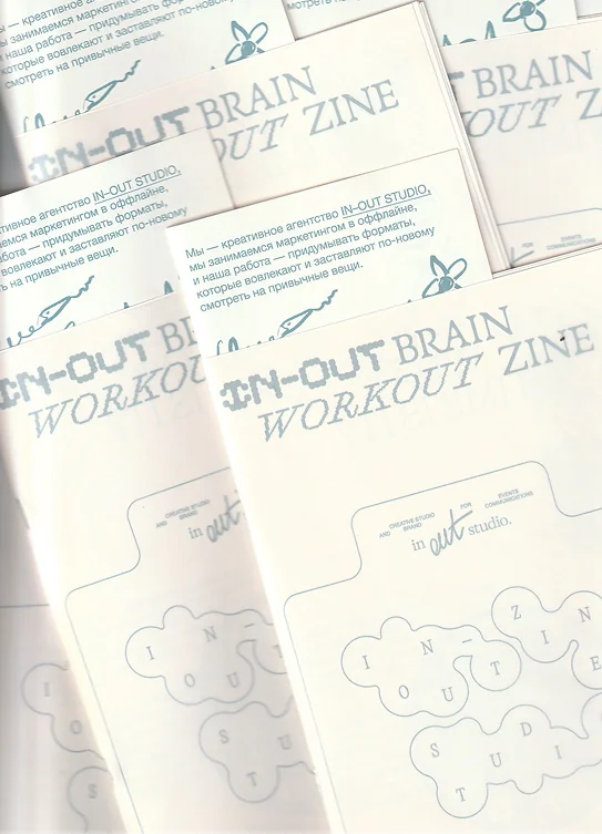
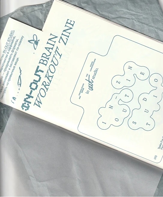
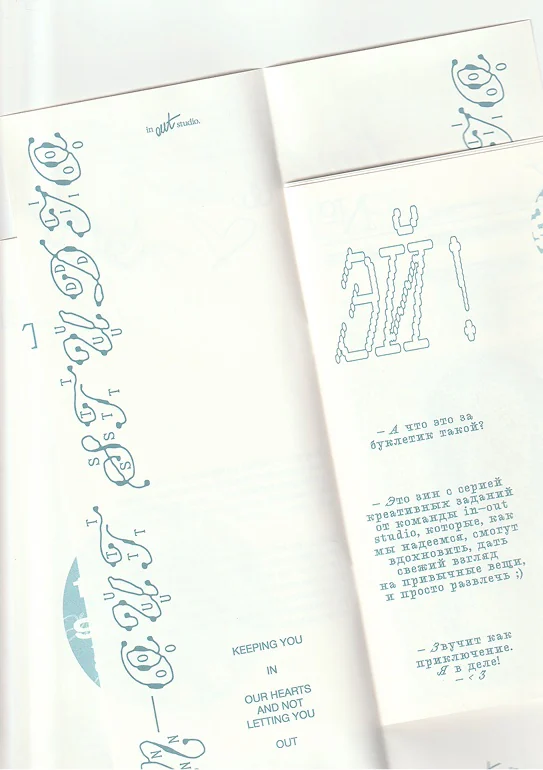
This zine features a series of creative prompts
developed by the IN–OUT Studio team, designed to inspire
and offer a fresh perspective on familiar things. I developed
the zine’s visual concept and illustrated each team member’s
task using metaphorical abstract imagery and typography.
The zine was created for a charity event supporting stroke
survivors. IN–OUT Studio had its own stand at the event,
where the zine was distributed to visitors.

I printed the zine myself on an office printer and
assembled every copy by hand. To make the production
process practical while keeping the design visually engaging,
I created a multi-format structure using only A4 sheets.
The section featuring key information—such as the logo and
an explanation of the zine’s purpose—is made from an A4
sheet folded along its short edge. This allows it to remain
visible throughout the reader’s interaction with the zine. The
sections made from A4 sheets folded along the long edge
contain the creative prompts and everything intended to feel
as though it is “inside,” while the first section always remains
“outside.”

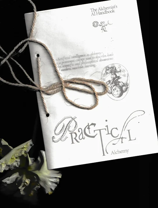
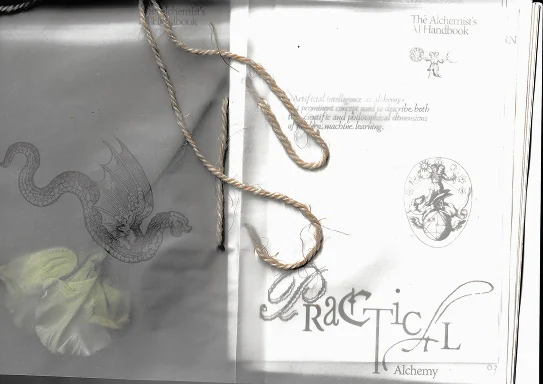
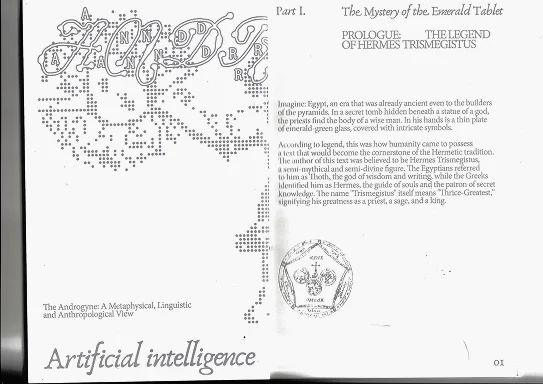
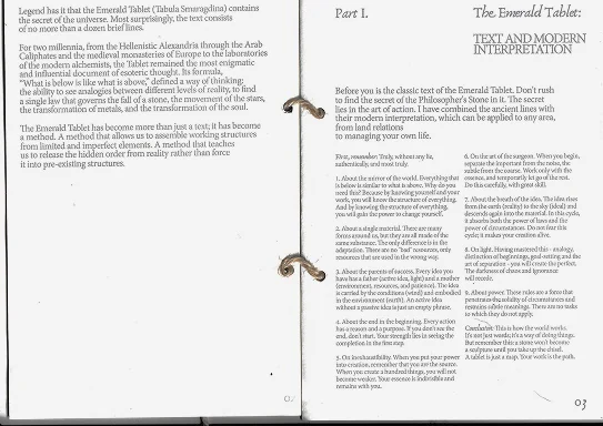
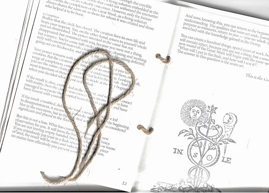
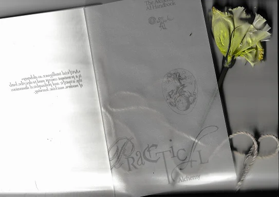
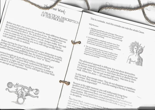
Zine cover tied with cord Cover and title page with cord Prologue spread: The Legend of Hermes Trismegistus The Emerald Tablet spread The Great Work spread with cord Practical Alchemy title page Spread with the In Sole emblem Part III spread: The New Hermes Spread on model creation Handbook cover and dragon illustration Spread with a flower on translucent paper Flower and amaranth on the open zine

Practical
Alchemy
Zine

  1. 1Editorial Design
  2. 2Printing

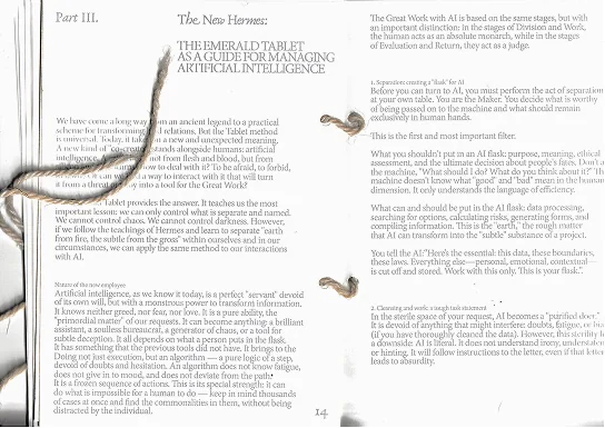
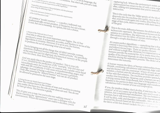
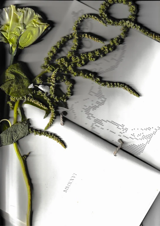
The Alchemist’s AI Handbook is an experimental
zine exploring artificial intelligence through the lens of
alchemy. Drawing on Sergei Ivasyuk’s essay Practical
Alchemy, it connects the alchemical processes of separation,
purification, and recombination with the ways we work with
AI: gathering fragments, recognising patterns, and refining
possibilities into something meaningful. Within this metaphor,
data becomes raw matter, while human intention and
judgment guide its transformation.

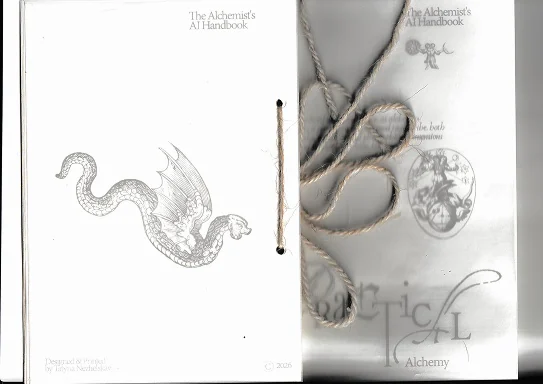
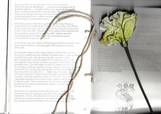
The design brings this relationship into physical
form. Alchemical illustrations sit alongside pixelated graphics
and experimental typography, connecting the visual language
of historical manuscripts with digital systems. Translucent
paper allows images and words to overlap, conceal, and
reveal one another, making transformation part of the reading
experience. The exposed cord binding gives the publication
the tactile character of a personal workbook.

Moving between an ancient handbook and a contemporary
experiment, the zine reflects on what it means to create with
AI—and on the human attention that turns generated
possibilities into considered work.

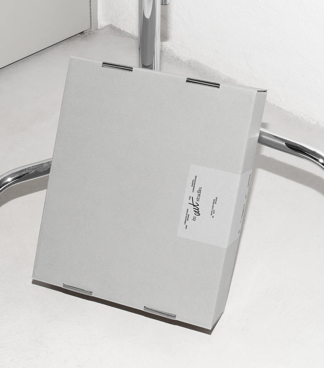
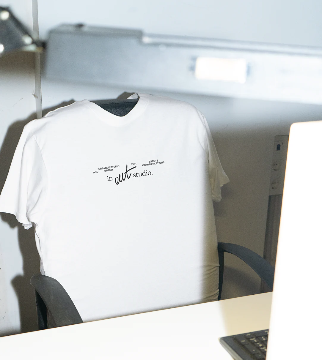
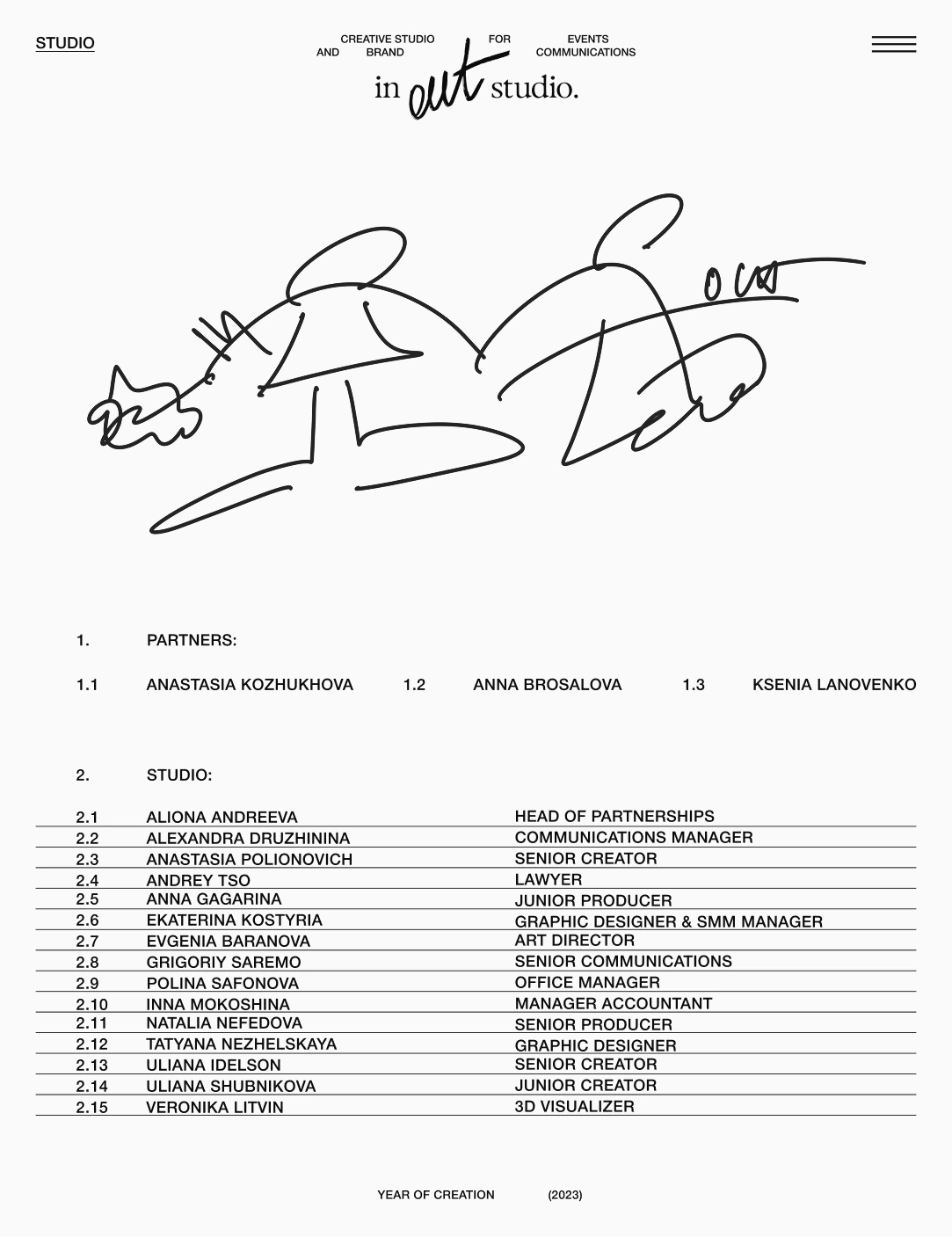
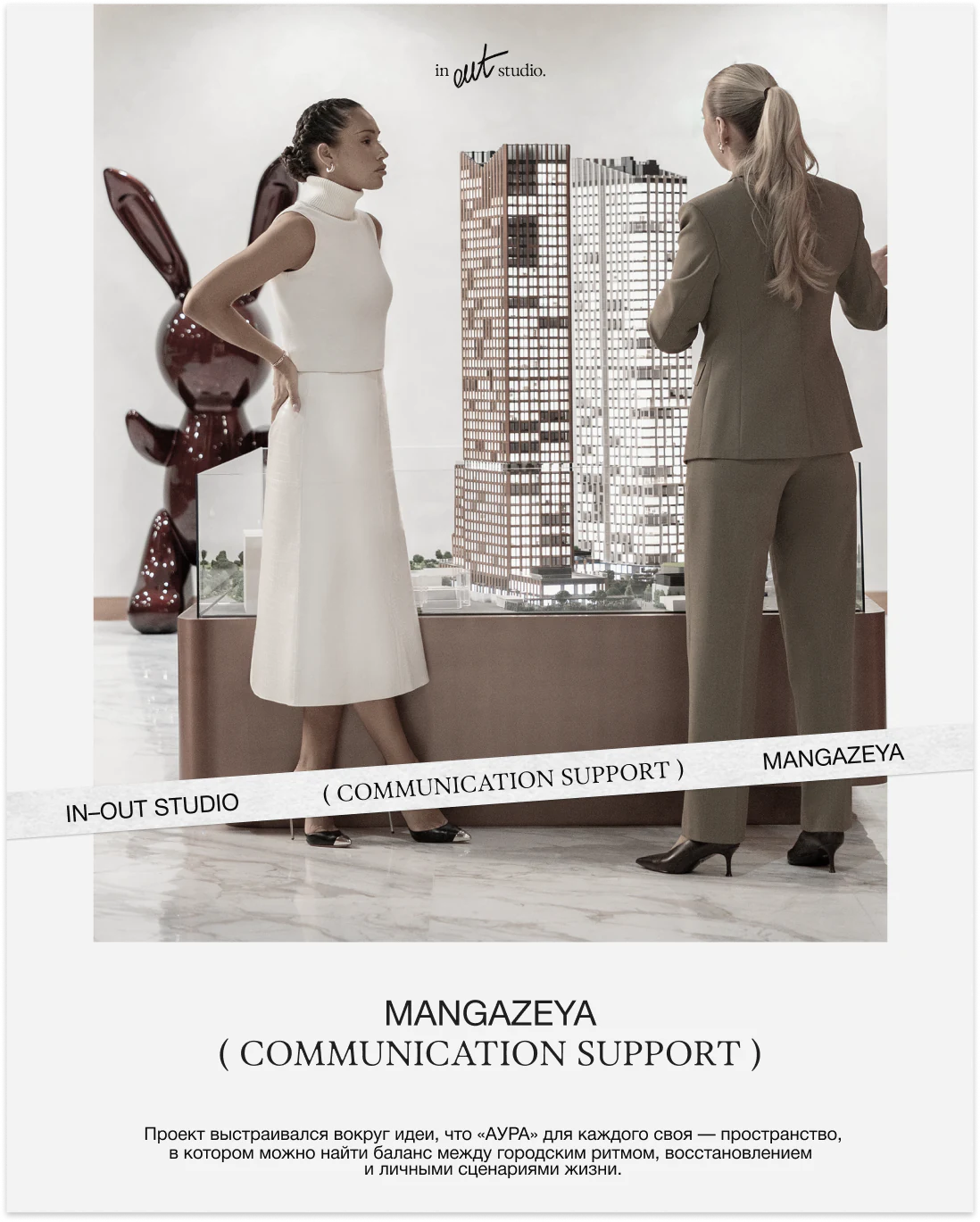
Round IN–OUT Studio XOXO sticker on a portrait Transparent envelopes with IN–OUT Studio stickers IN–OUT Studio branded cardboard box White IN–OUT Studio T-shirt IN–OUT Studio website team page Mangazeya communication support visual by IN–OUT Studio

IN–OUT
Studio
Identity

  1. 1Brand Identity
  2. 2AI-Visuals
  3. 3Website

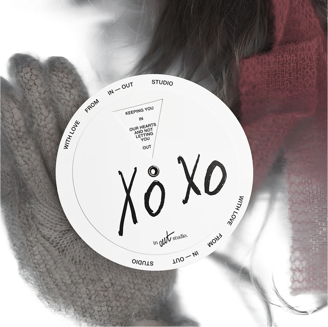
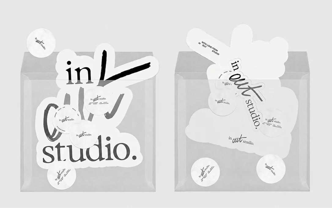
The new in-out studio identity is a combination
of structure and freedom, logic and creativity. The logo
combines serif type and a handwritten “OUT”: the strict
typography reflects order, processes, and precision, while
the handwritten part represents unconventional thinking
and “going beyond the boundaries”. “IN” represents
the tasks and requests that people come to us with. “OUT”
represents the result: bright, unexpected, and captivating.

The main font is Helvetica — simple and strict, without
unnecessary details. It reflects the studio’s “less is more”
approach: simple elements and solutions from which
the style and meanings are born.

In this project, as part of the identity, printing materials,
merchandise, website, and templates for social media
were developed.

The logo consists of two parts. The first part
is essentially an accent font that refers to the progressive
style and avant-garde collections of the brand. Meanwhile,
the second part is set in a modern-style serif font, which,
on one hand, reminds us of world-famous fashion houses
with a long history, and on the other, declares a new
approach and a rethinking of their traditions.

When developing the logo, it was important to effectively
express and highlight the uniqueness of the brand while also
provoking effective associations for the potential audience
at first glance. In this context, the main part of the logo
is designed in the style of machine stitching, resonating
with it both in the name and in the visual representation.
The additional part clearly and distinctly positions the brand.
Both of these elements also appeal to the foreign audience,
which is an important segment for the brand.

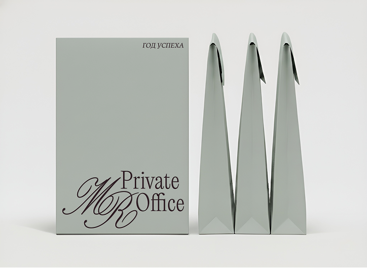
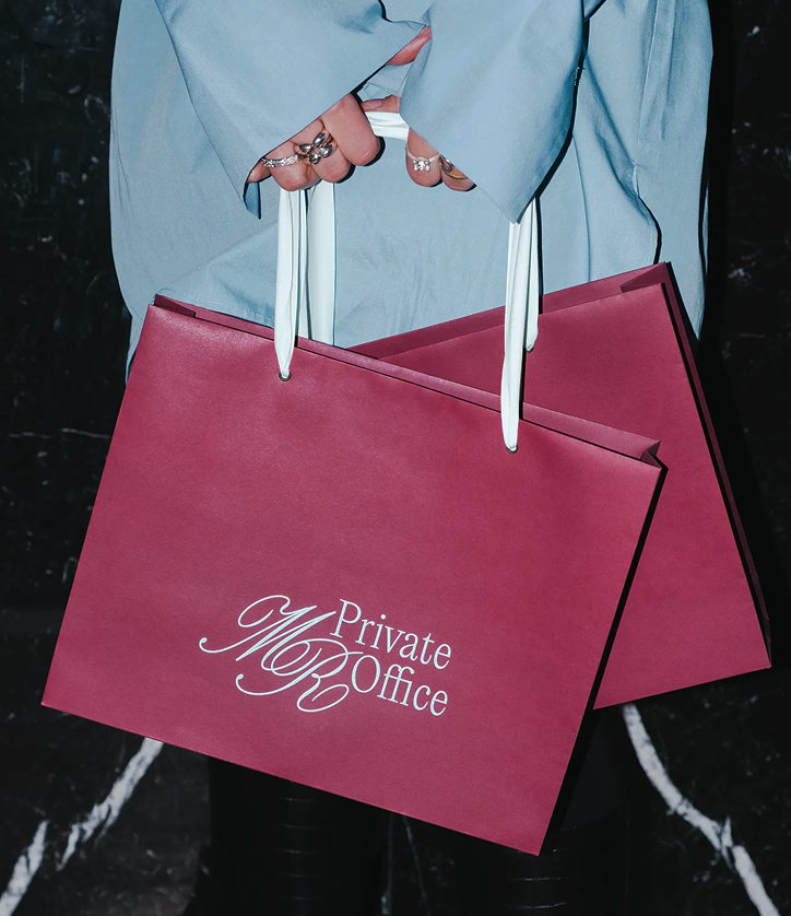
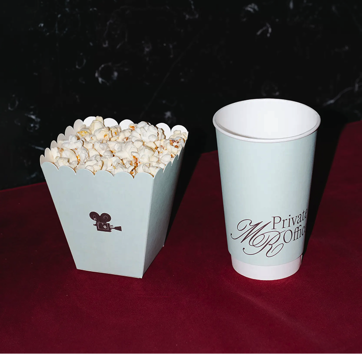
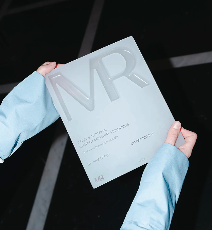
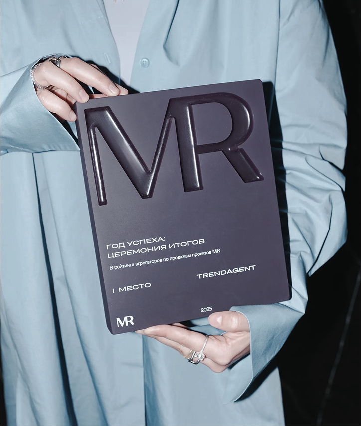
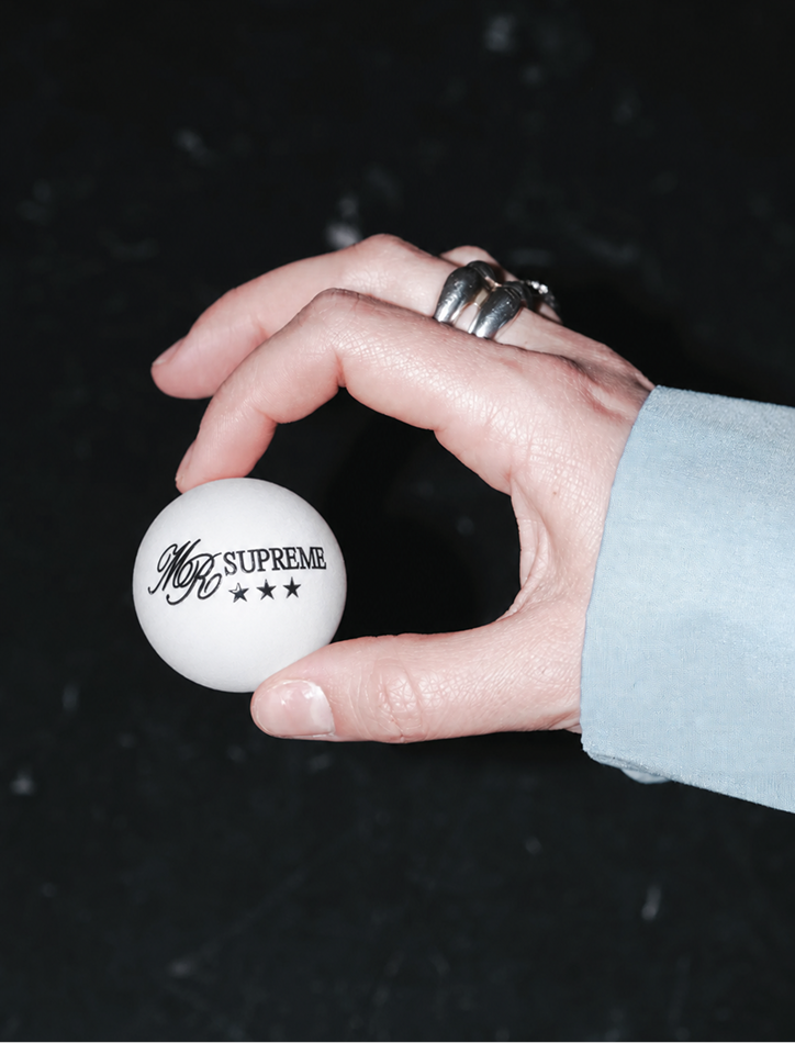
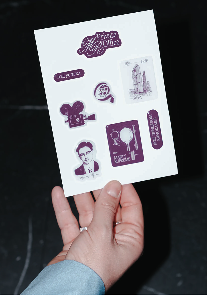
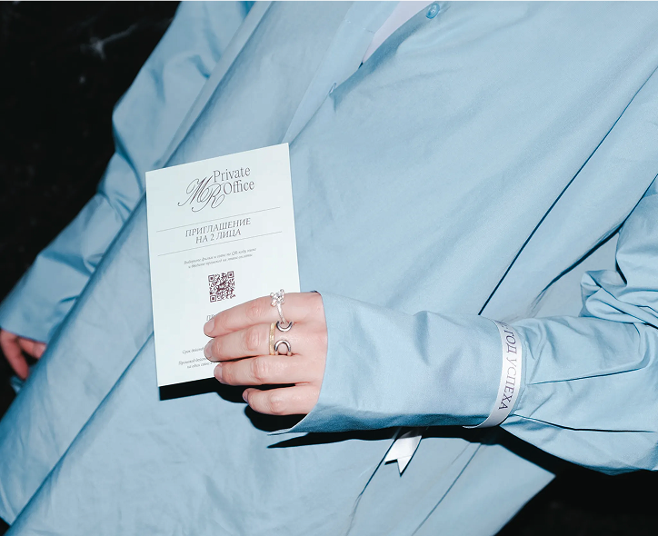
Private Office presentation box and bags Burgundy Private Office shopping bags Private Office branded popcorn and cup Light MR award plaque Dark MR award plaque MR Supreme branded ball Private Office sticker sheet Private Office invitation

MR Group

  1. 1Brand Identity

In February, MR held its annual awards
ceremony for MR, MR Private, and MR Office brokers at the
Khudozhestvenny Cinema; the event was organized by in-out
studio. The evening was designed as a cohesive event with a
cinematic aesthetic: reception featuring a jazz set and
catering by Niki, a formal ceremony in the main hall, and a
group film screening. A seamless flow was planned for the
450 guests – from the entrance to the final touch. The formal
part of the ceremony was directed by Savva Savelyev, with
Maxim Vitorgan serving as the host; the atmosphere was
enhanced by a jazz trio and a guest management team.
Awards were prepared for the brokers: special prizes and
certificates, gifts for the winners, and personalized souvenirs
for each guest. The group screening of the film served as the
emotional highlight of the evening and a fitting conclusion to
the storytelling, blending prestige, continuity, and the
atmosphere of a major cinematic event.

A custom brand identity was created specifically
for the project, unifying the MR themes through a calligraphic
monogram and a color palette of mint, porcelain, and
chocolate-burgundy shades. It formed the entire visual
concept: from invitations and popcorn branding to the photo
booth and awards. The key concept of “a year like a movie”
was reflected in the set design and the evening’s program.

Cosmoscow menu with table number on a plate Cosmoscow folded menu on a place setting Open gala dinner menu on a black plate Wide view of the Cosmoscow gala dinner Cosmoscow installation behind the dinner tables Cosmoscow dinner table with flowers and menus Architecture of Dreams menu composition Architecture of Dreams menu and guest name card Cosmoscow dinner table with Architecture of Dreams menus Menu composition with a guest name card Architecture of Dreams menu and name card composition

Cosmoscow
Auction

  1. 1Experimental
    Polygraphy

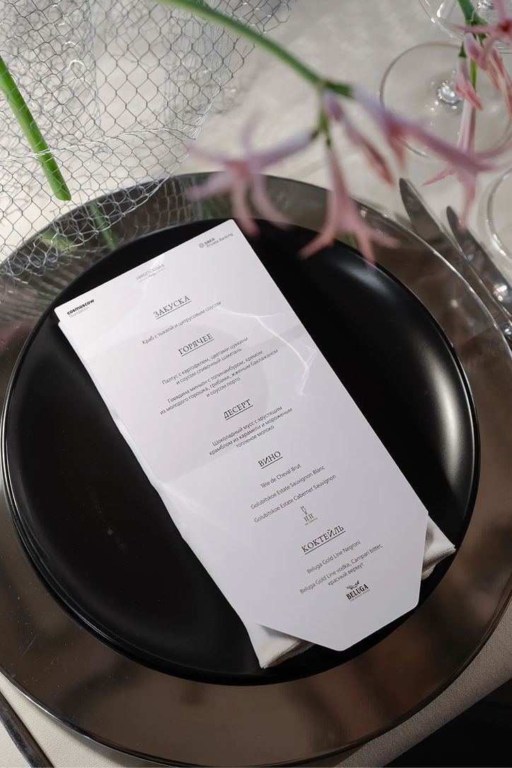
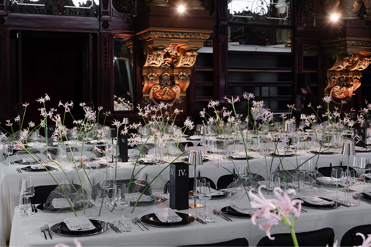
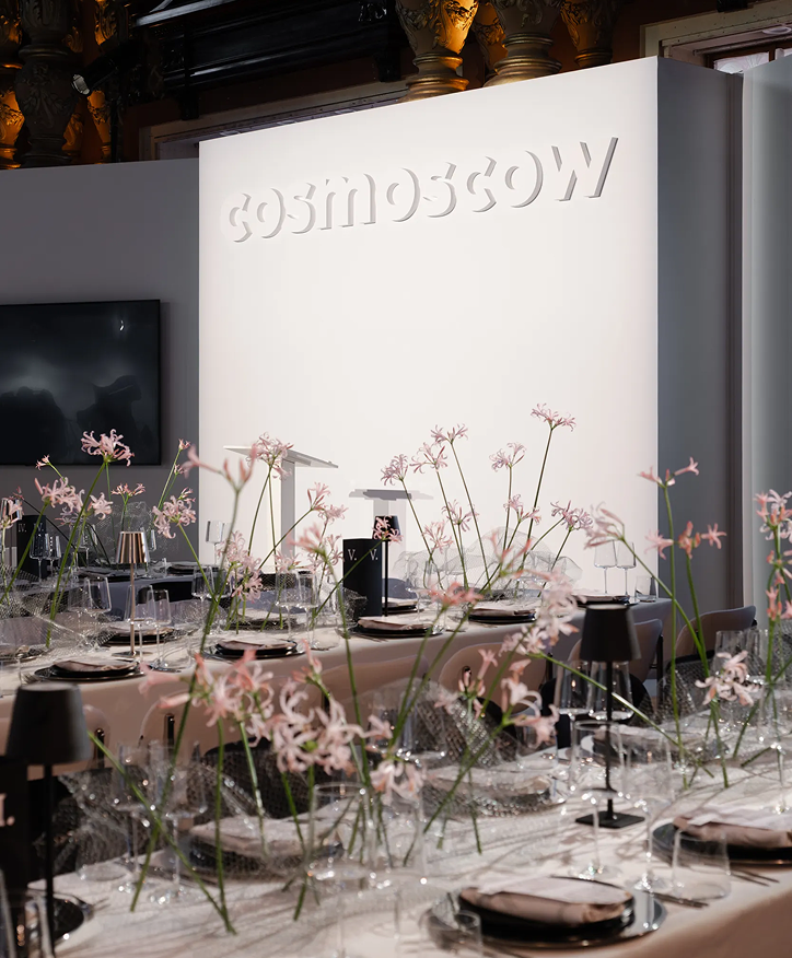
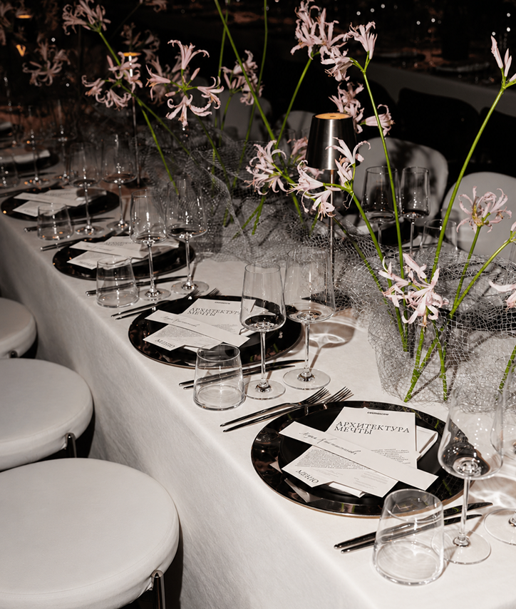
The charity auction of the Cosmoscow
Foundation for Contemporary Art took place with in-out
studio as the organizing partner. The team handled the dinner
set design, lighting and sound for the evening, and the overall
concept — from the initial idea to the final result. The project
combined several formats within single venue and included
the exhibition build at Eliseevsky, developing lighting
solutions, and delivering the full gala dinner setup. The pre-
auction exhibition “Architecture of Dreams” was held from
April 9 until the final gala dinner. The in-out studio team was
involved in the planning and design of the exhibition, helping
to create an exhibit that aligns with the curator’s vision and
the specific features of the venue.

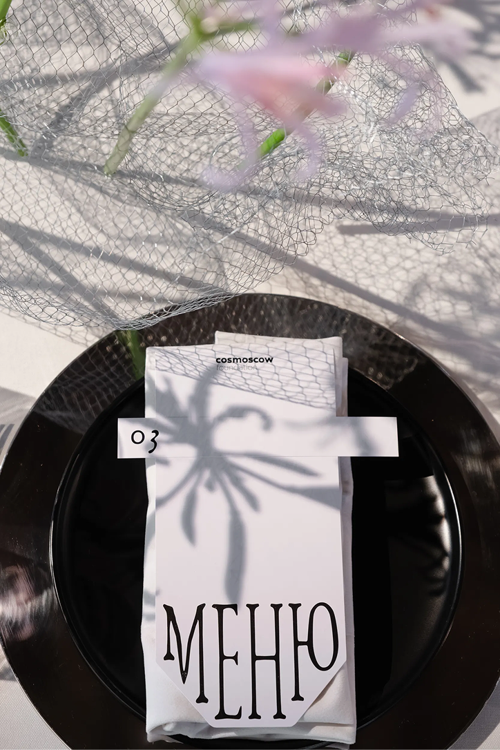
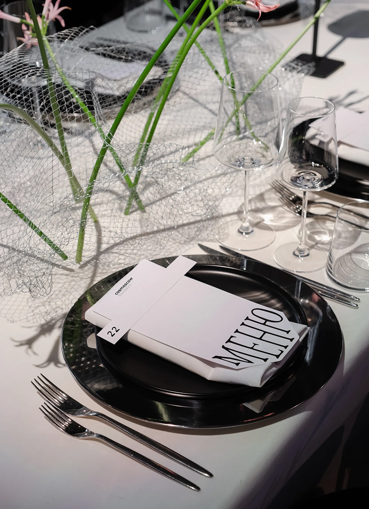
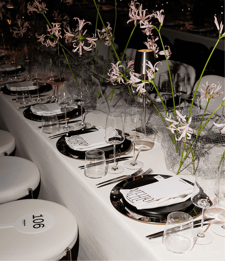
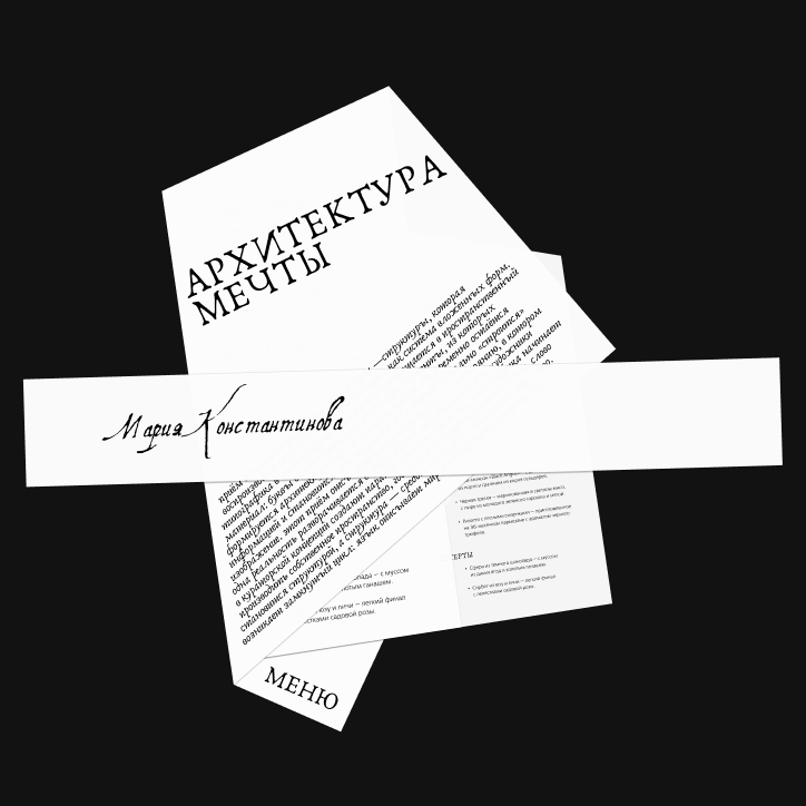
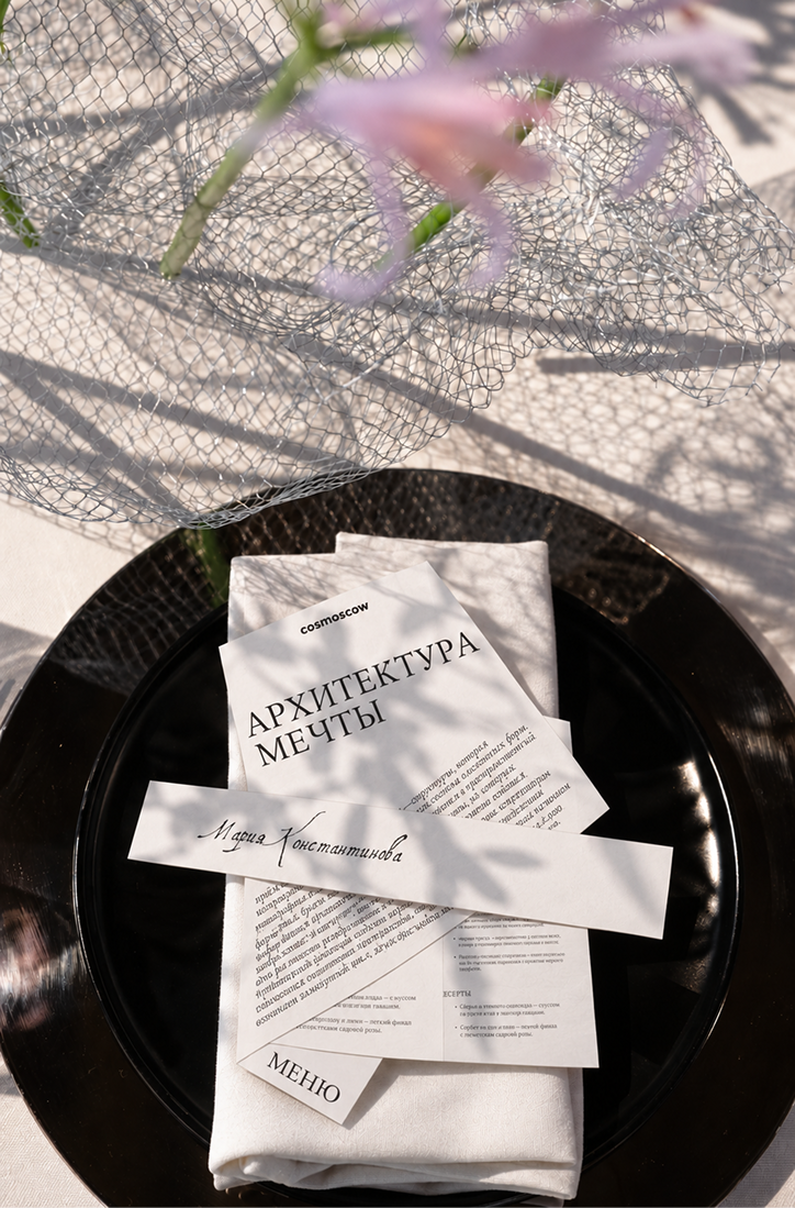
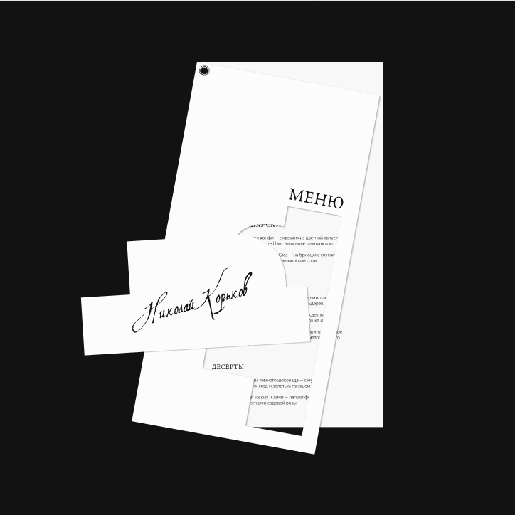
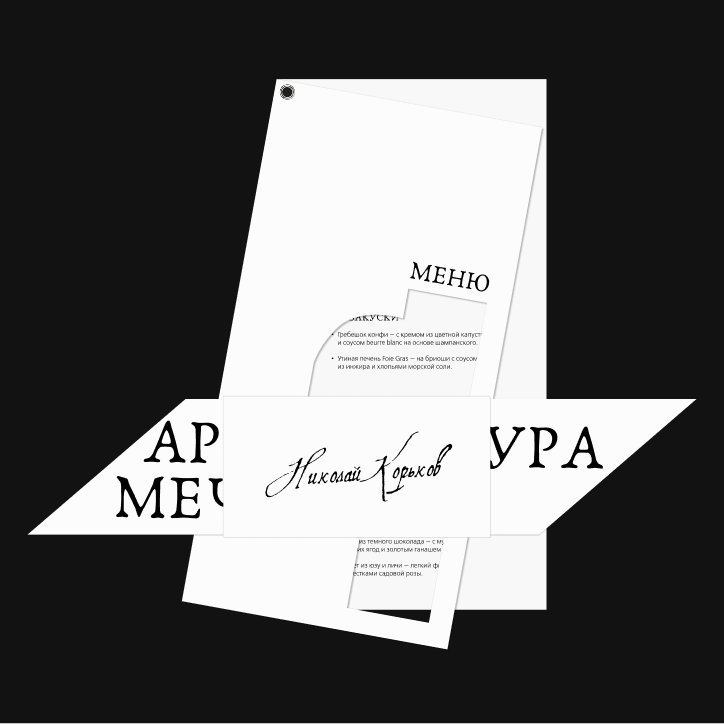
I was responsible for developing the printing
design for this event. During the project, several menu
implementation options were developed. In its design,
it was important to convey the ideas of modern architecture.
On the left, you can see the implemented version at the
very beginning and the other variations at the end.

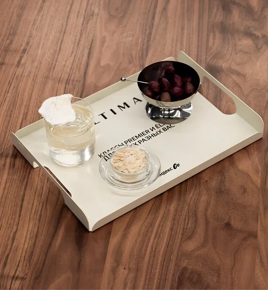
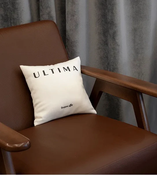
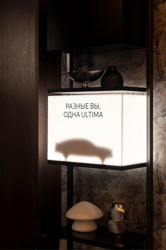
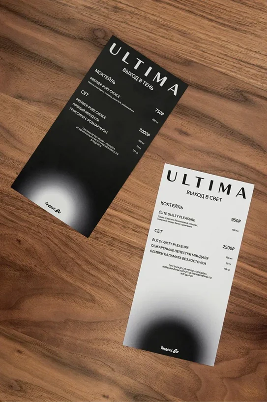
Ultima card next to a glass Ultima Yandex Go bar in the cinema lounge Black Ultima tray with snacks White Ultima tray with snacks Ultima cushion on a leather armchair Light box: Different you, one Ultima Dark and light bar menus

Ultima
Yandex Go

  1. 1Branding
  2. 2Polygraphy

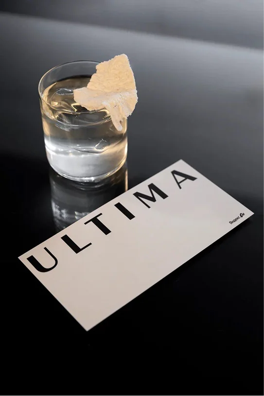
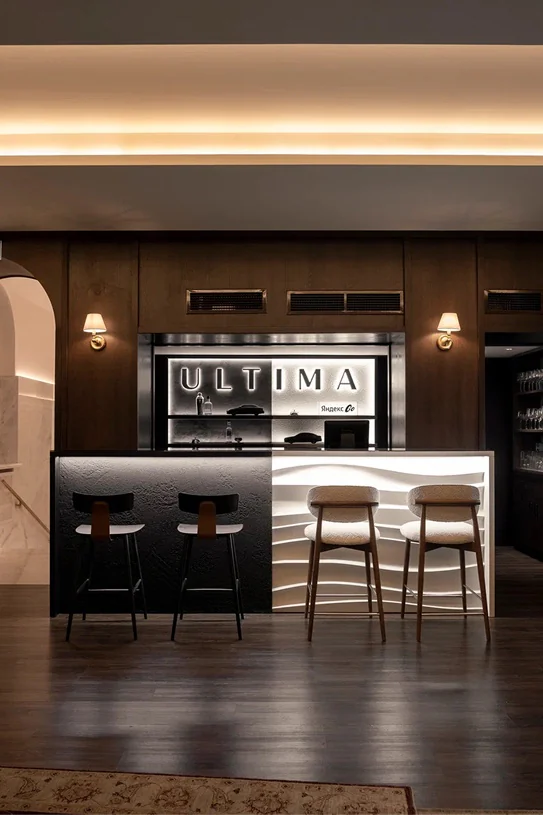
The in-out studio team developed and
implemented the integration of the Ultima Yandex Go service
into the Khudozhestvenny cinema. A branded Ultima Yandex
Go bar was created in the lounge of the Chamber Hall,
which seamlessly blended into the architecture and guest
flow of the cinema over several months. The launch of the
partnership was marked by a private film screening for
friends and brand ambassadors, which the in-out studio
team supervised in its entirety — from sending out
invitations to arranging the photoshoot. The integration
became a beautiful entry point into the atmosphere
of Ultima Yandex Go within one of the city’s key
cultural spaces.

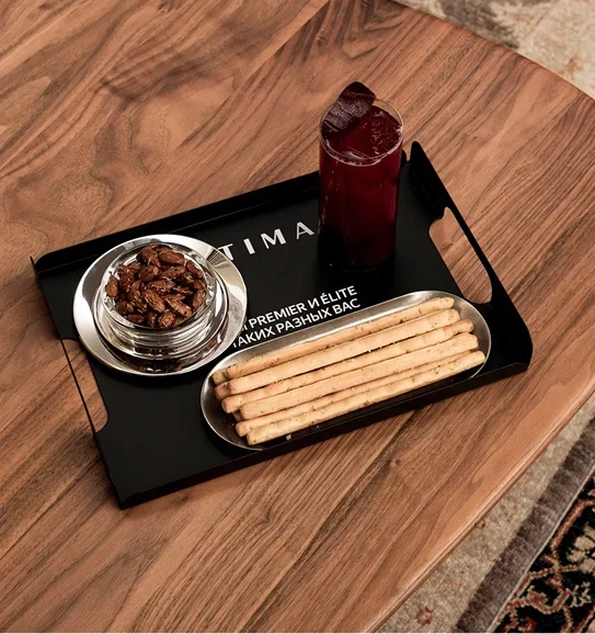
The bar concept was based on the brand’s
current campaign, which emphasized the idea of duality.
The contrast was conveyed in the visual language, materials,
presentation, and even the bar menu. The light and dark
sides of the space differed in texture, color, and mood, while
maintaining a consistent design code. The elements of the
space included a custom bar counter, a curated selection
of tableware, and items with taglines created
by us specifically for Ultima Yandex Go.

My task was to develop and prepare for implementation
and production all physical branding materials
and printing materials.

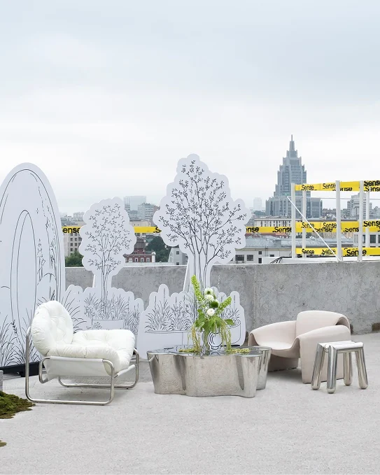
Sense wall and cranes on the construction site Rooftop lounge with white furniture Green canapés on a steel tray Flowers on a mirrored table Wire flower and a Phantom card Drawn interior board against concrete Grey canapés with Phantom picks Concrete blocks and moss on the terrace Phantom board in front of the building Guests in the drawn garden Chrome tube chair by a drawn screen

.Sense
Monolith

  1. 1Graphic Design
    for all Printed
    Materials &
    Production Files

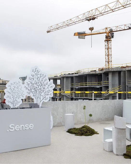
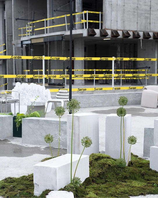
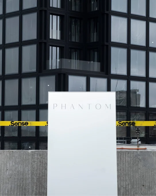
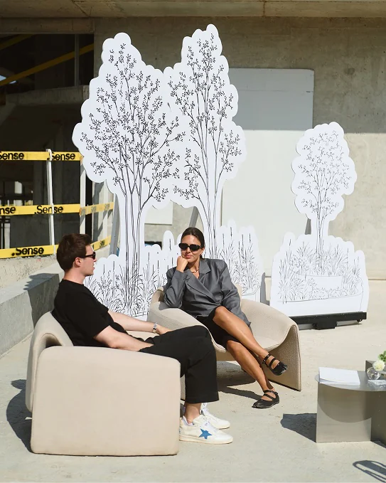
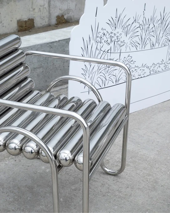
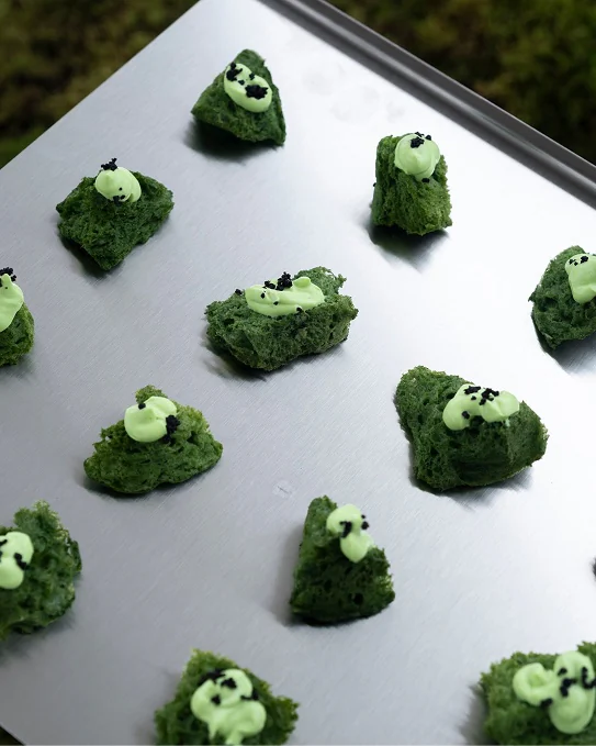
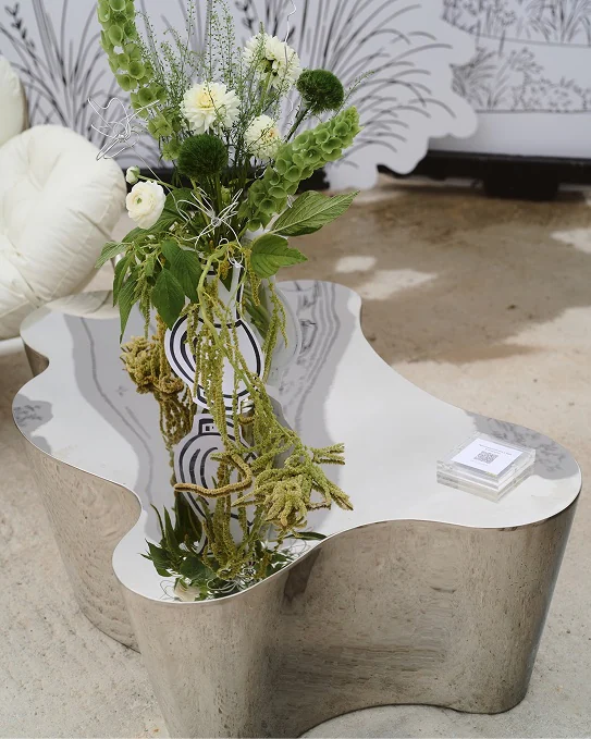
The main part of the event took place
on the PHANTOM rooftop terrace, overlooking the city.
Once completed, the space will feature a residents’ bar and
terrace, as well as a gym and an open-air workout area.
For the event, it was transformed into a venue with lounge
areas, a bar, a gastronomic program and a DJ sets.

For in-out studio, the project was a professional challenge:
building an event on the rooftop of an active construction site
while creating multiple guest journeys tailored to different
audiences. We thank the .Sense team for their trust and
collaboration.

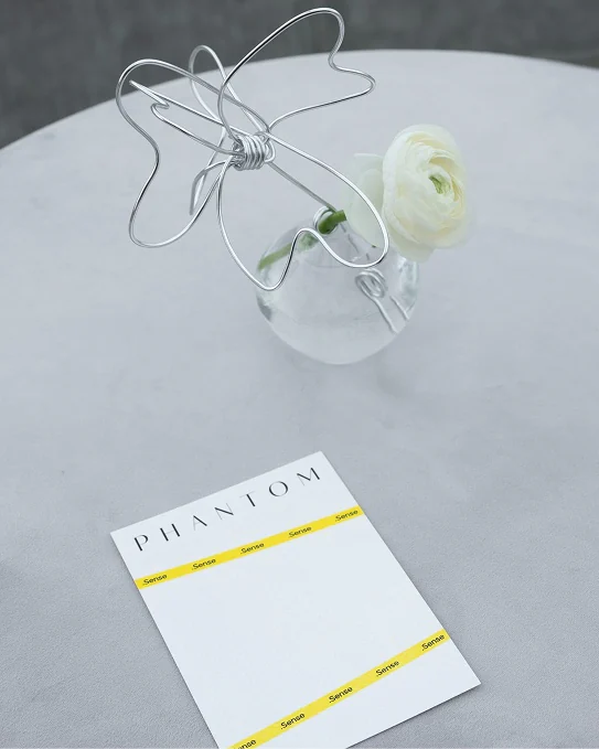
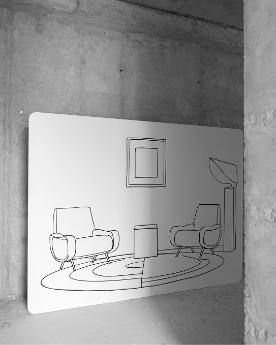
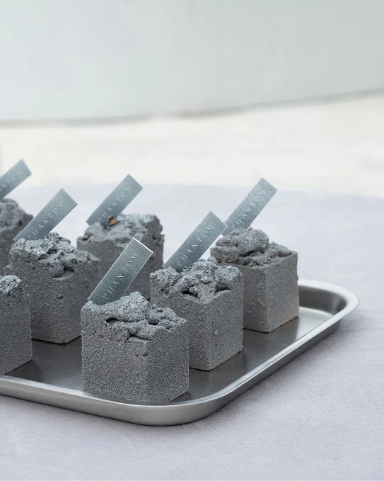
I was responsible for developing the printing
design for this event. During the project, several menu
implementation options were developed. In its design,
it was important to convey the ideas of modern architecture.
On the left, you can see the implemented version at the
very beginning and the other variations at the end.

Guest with popcorn and desserts Signposts to the event zones Guest with a Fashion Rebels envelope Branded cups at the cafe counter Customisation counter with embroidery machines Branded skis and snowboards Postcard rack with the Après-Ski series Embroidery machine at work Guest by the lamoda × Fashion Rebels signs Fashion Rebels Cafe sign above the guests

Fashion
Rebels

  1. 1Graphic Design
    for all Printed
    Materials &
    Production Files

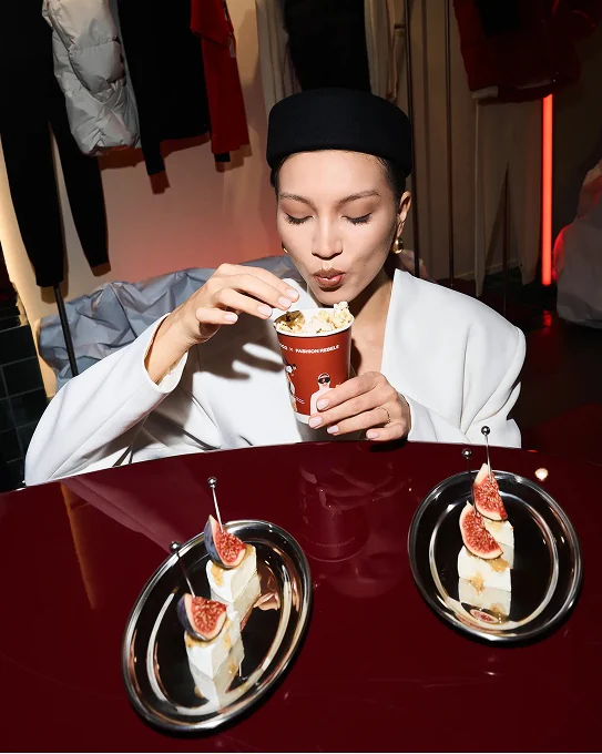
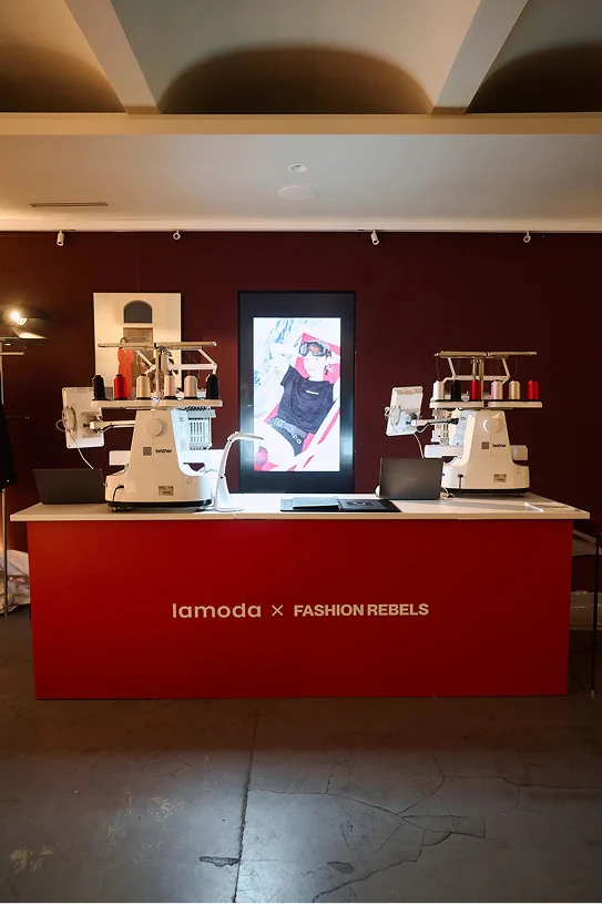
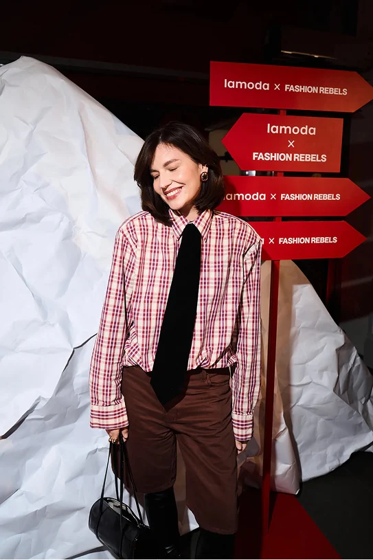
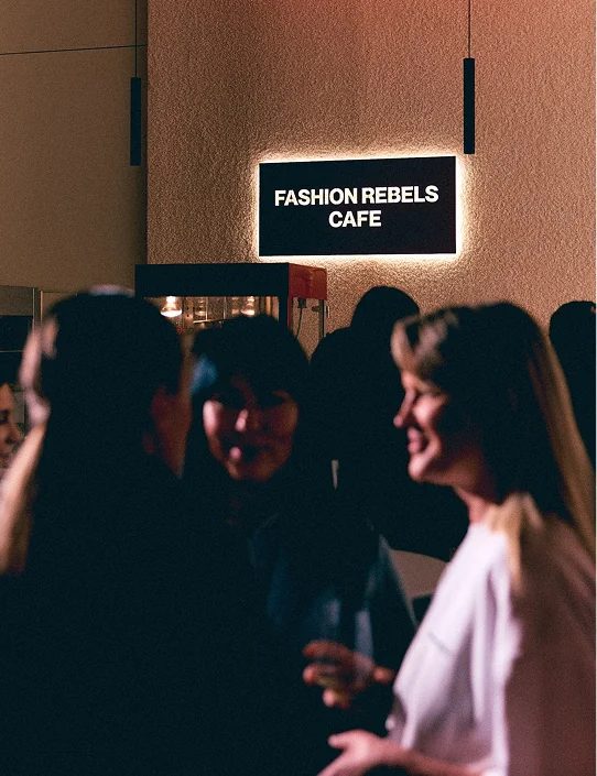
The in-out studio agency developed and
implemented an event for FASHION REBELS’ new collection
in collaboration with Lamoda. On October 21, the brand’s
boutique hosted Almost Famous, a cocktail party for 170
guests dedicated to the release of the après ski collection.
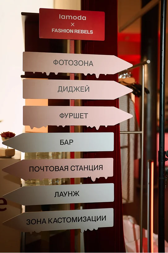
The space included a welcome area, brand activations,
a bar, a photo zone, and lounge areas on the two floors
of the boutique.

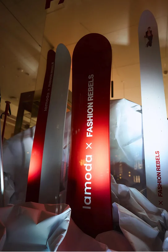
The main attractions were the mulled wine bar and the photo
zone featuring bright red lighting design. The display window
and an extra photo spot were decorated with crumpled paper
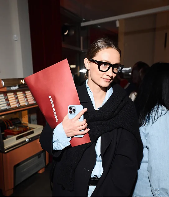
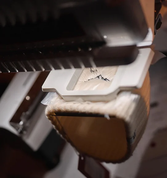
elements imitating snowy slopes. A customization area was
situated on the lower level there, the guests could decorate
knitted accessories of their choice with patches and initials,
and take them home in branded FASHION REBELS
envelopes. The evening was accompanied by a vinyl
DJ set by Andrey Zakharov.

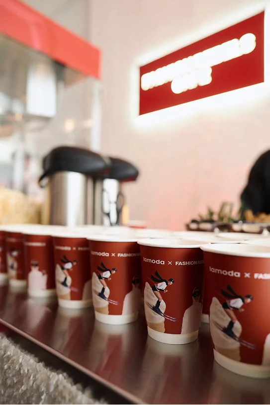
The visual language of the event combined
the aesthetics of a ski resort with the elements of glamorous
retro style — expanding from the design of the cups to the
decoration of the lounges and the catering zone.

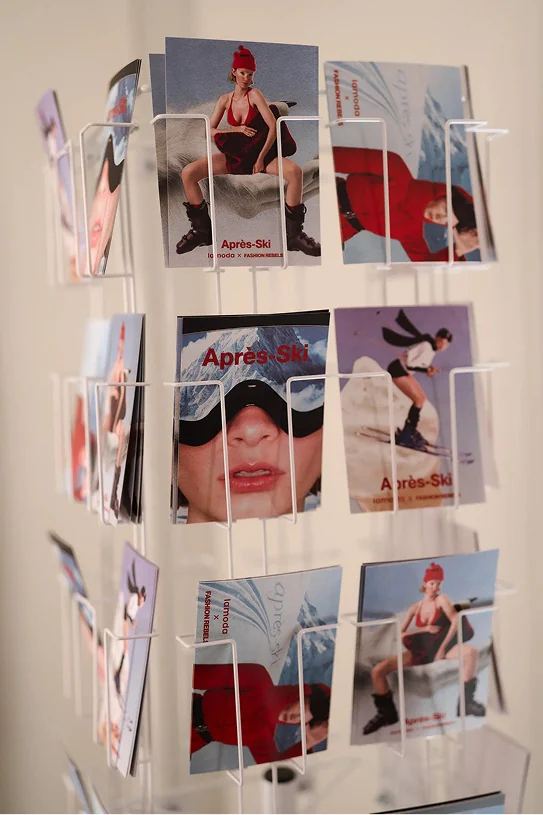
In this project, I came up with and prepared
the design for all physical media: cups, postcards, envelopes,
a composite index with a complex unique format, images
for embroidery, signs, and decorating skis and snowboards
with the corporate design.

Tatyana Nezhelskaya